OBJECTIVE
Design the complete brand identity
for a debut children's heirloom label;
one that signals tenderness, natural quality,
and quiet luxury from the very first impression.
Design the complete brand identity
for a debut children's heirloom label;
one that signals tenderness, natural quality,
and quiet luxury from the very first impression.
SERVICES
Brand Identity
Logo Design
Monogram Development
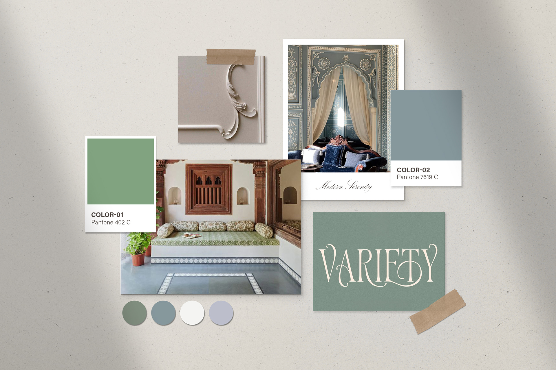
Colour System
Typography System
Brand Guidelines
Mascots and brand illustrations
It started with a nephew.
The founder, a fashion designer from Chennai,
dressed her infant nephew in something she'd made herself —
cut from bamboo silk, finished by hand.
The queries that followed were immediate.
Where did you get that? Can you make one for mine?
dressed her infant nephew in something she'd made herself —
cut from bamboo silk, finished by hand.
The queries that followed were immediate.
Where did you get that? Can you make one for mine?
She already knew the answer to the gap they were circling.
The children's market was full of fast fashion dressed in natural-sounding language —
and genuinely premium, cruelty-free, heirloom-worthy clothing
for babies and young children was almost nowhere to be found.
Not at this standard. Not with this kind of feeling.
The children's market was full of fast fashion dressed in natural-sounding language —
and genuinely premium, cruelty-free, heirloom-worthy clothing
for babies and young children was almost nowhere to be found.
Not at this standard. Not with this kind of feeling.
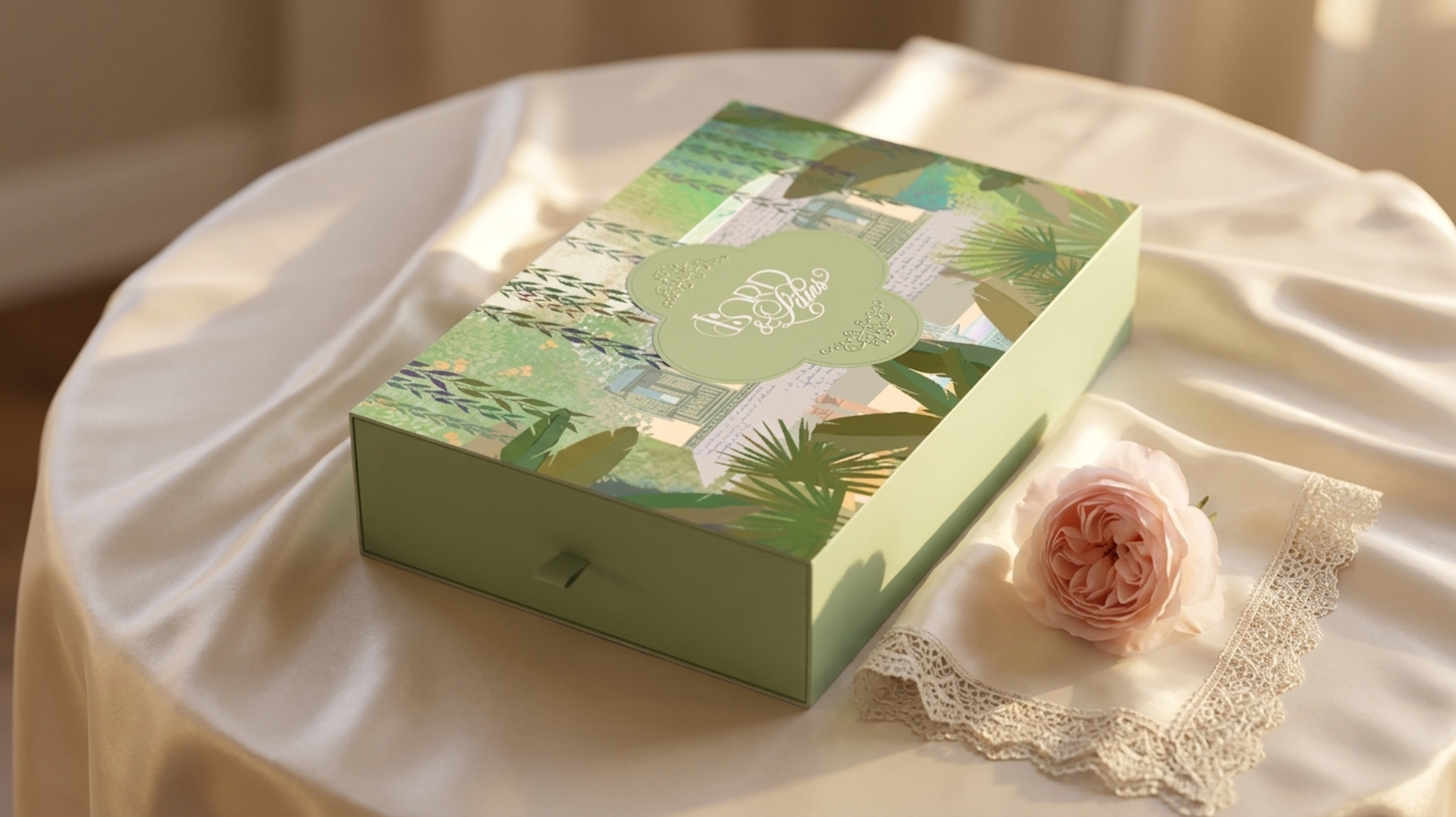
Lord & Lilies was her answer.
The brief was to build an identity that felt like it had always existed.
Timeless without being stiff. Tender without being precious.
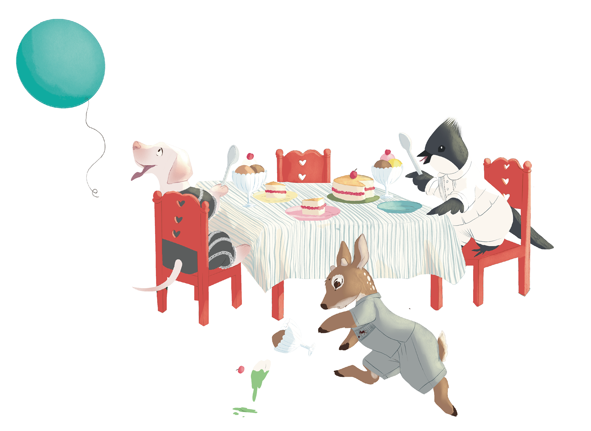
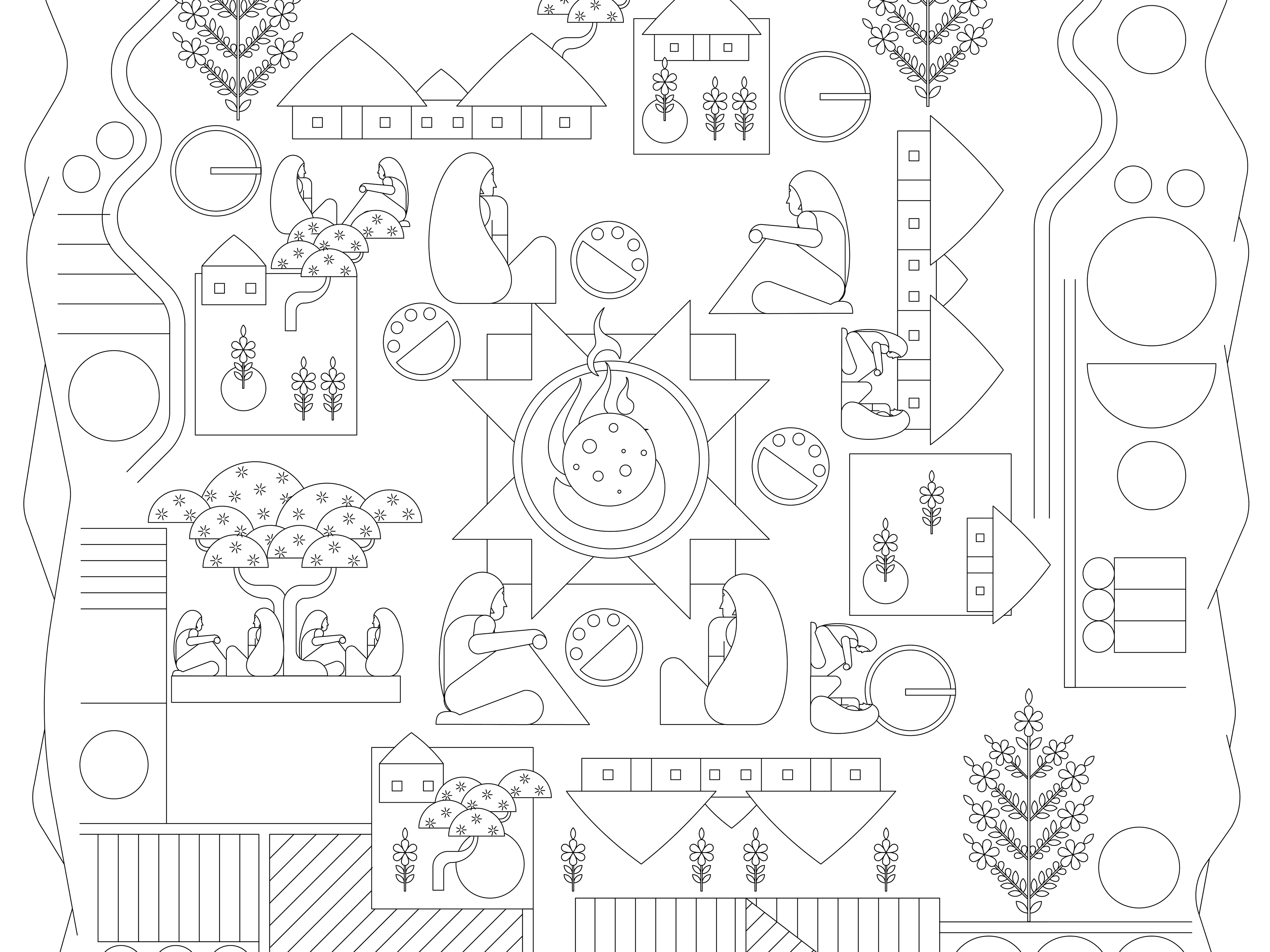
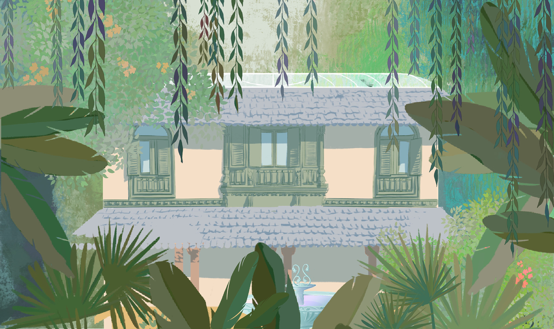
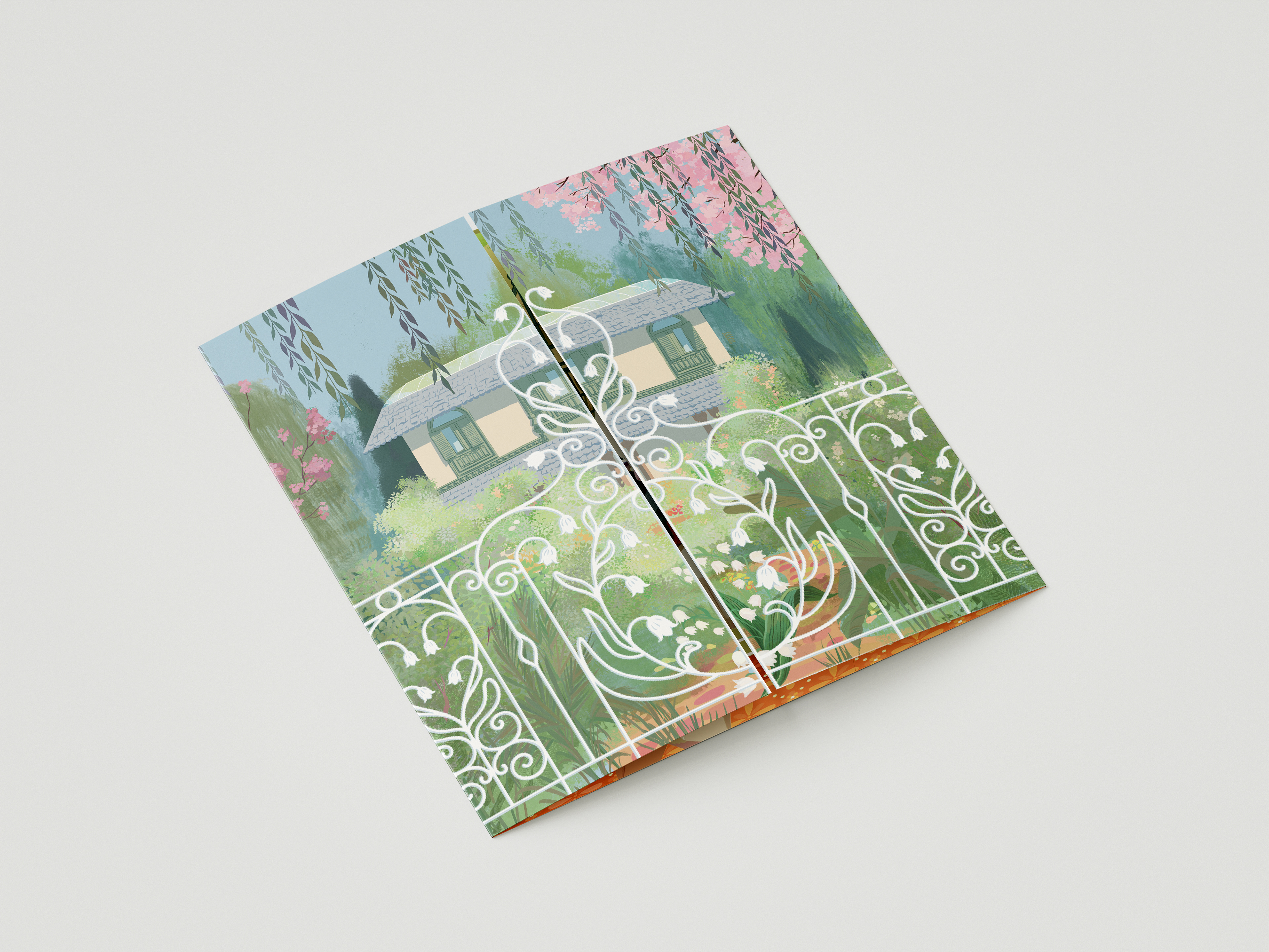
The brand world draws from the unhurried beauty of colonial-era Indian domestic life. Verandahs softened by filtered afternoon light. Monsoon gardens heavy with bloom. The particular quiet of a house where beautiful things are kept — a linen smock passed from an older sibling, a dress that survives being outgrown.
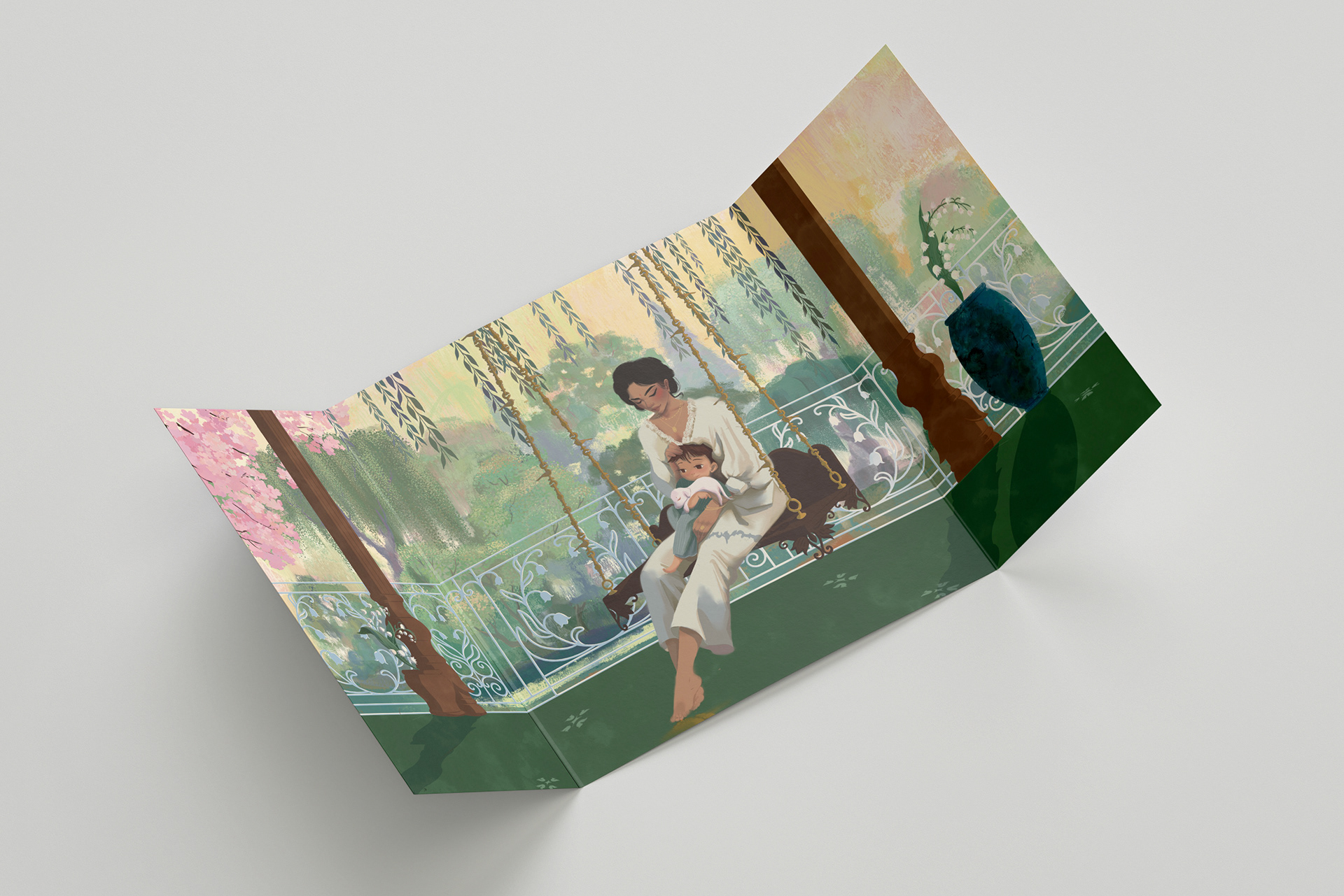
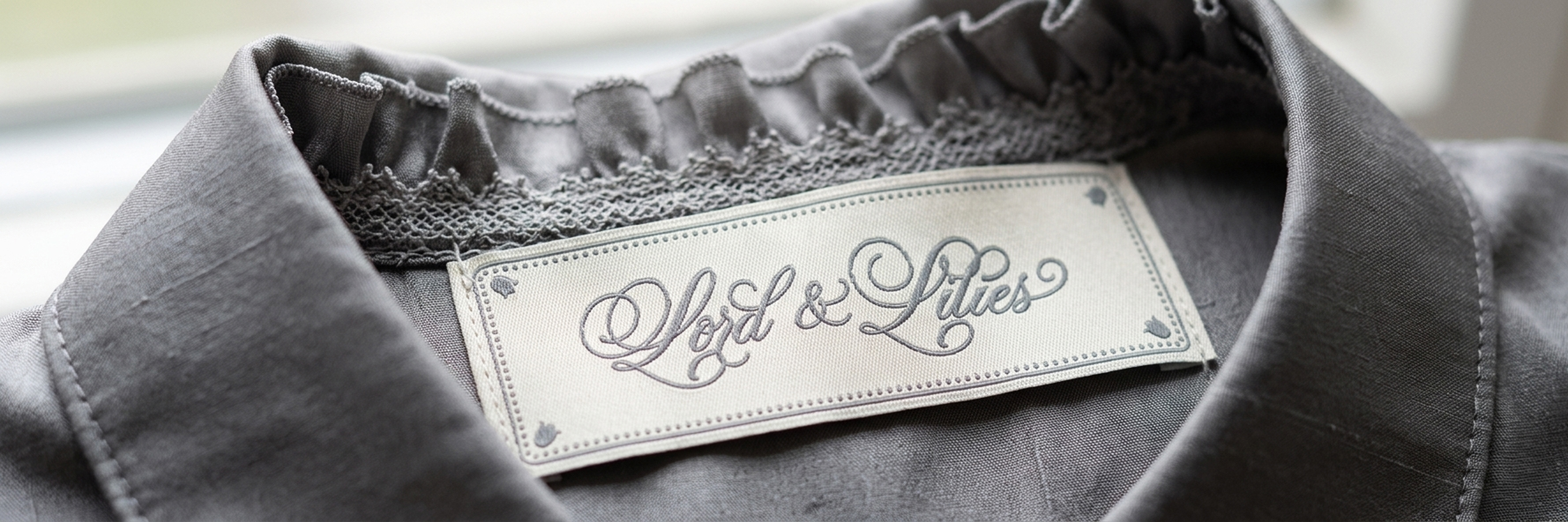
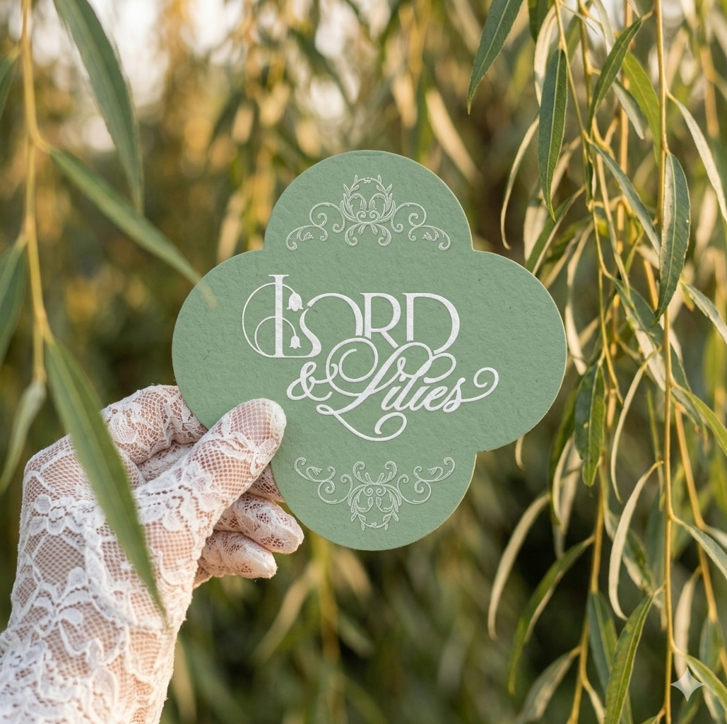
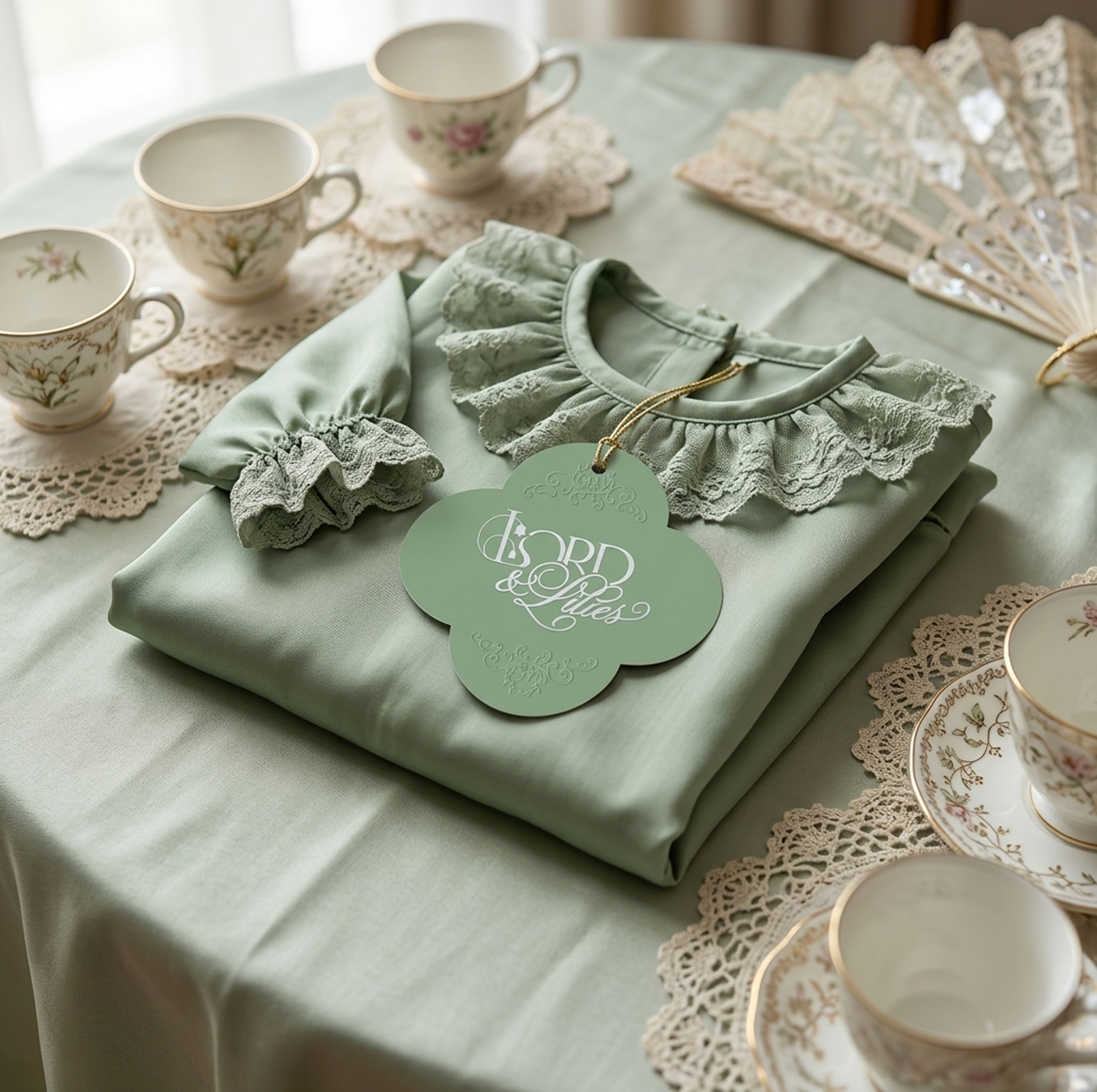
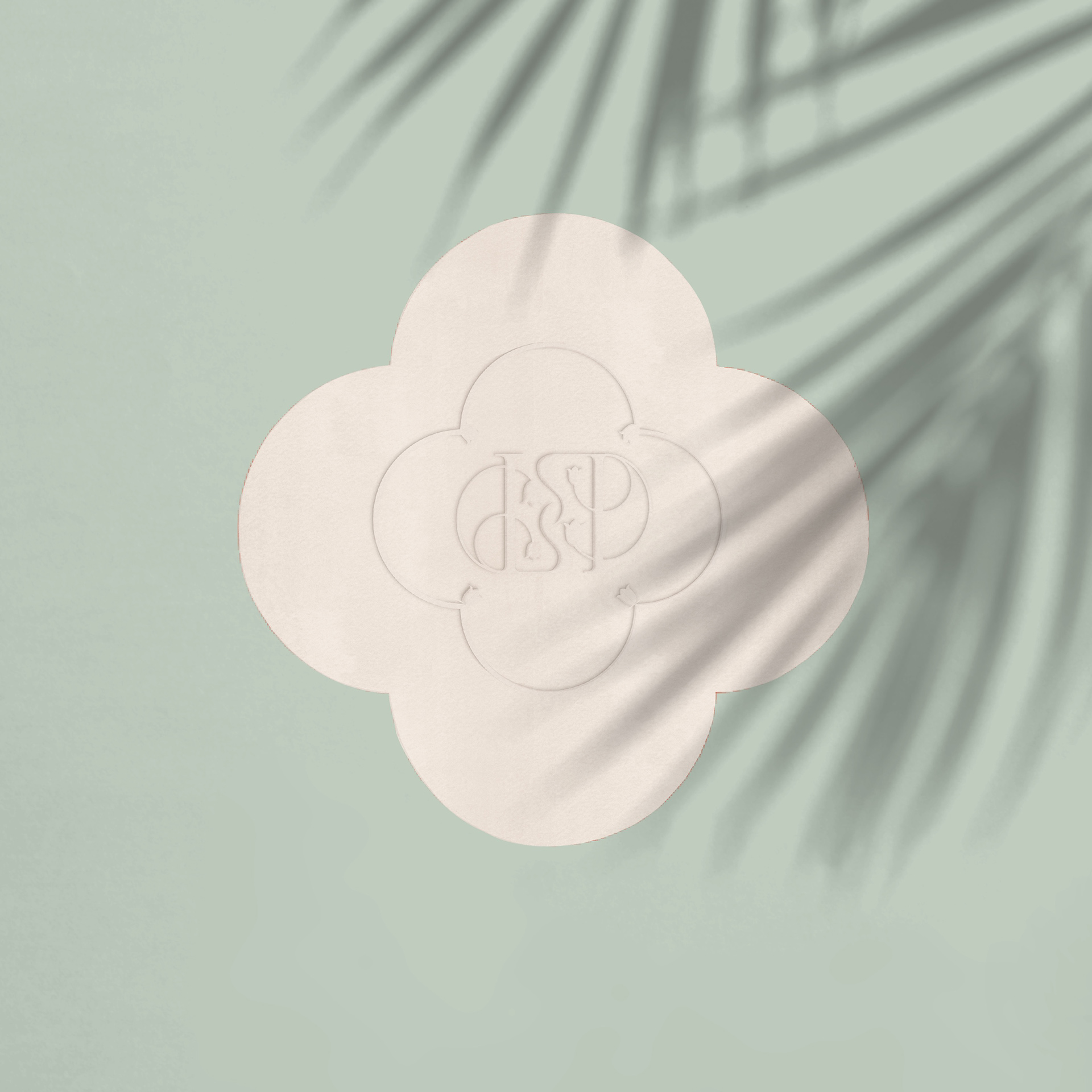
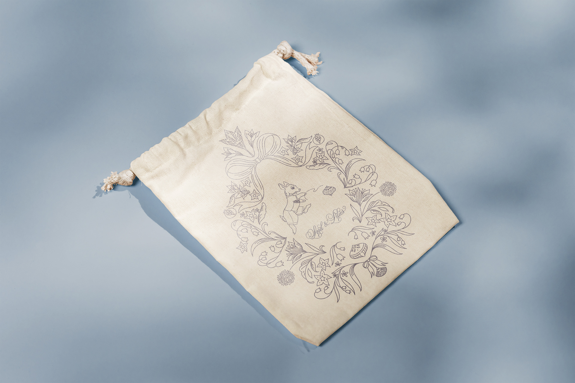
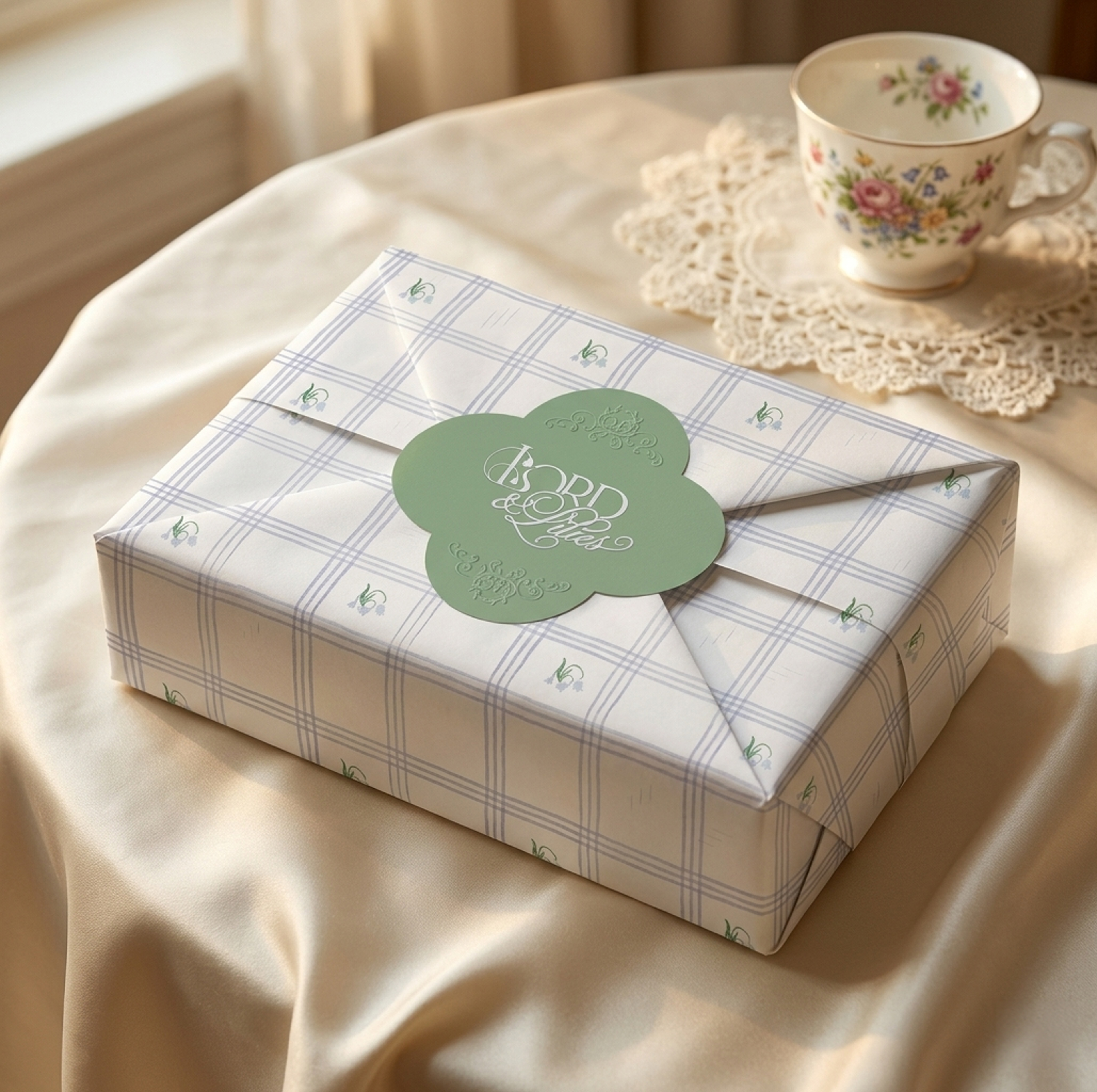
At the centre of the identity is a monogram — the oldest form of a mark. Chosen because it carries history in its bones. Initials pressed into wax. Embroidered onto a handkerchief. Engraved in silver. For Lord & Lilies, the monogram does its quietest, most confident work. It doesn't explain itself. It signs.
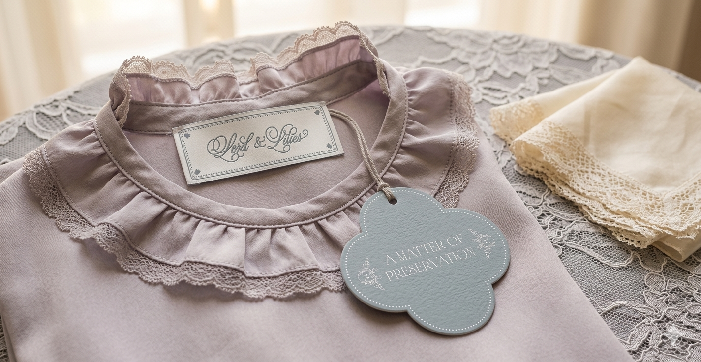
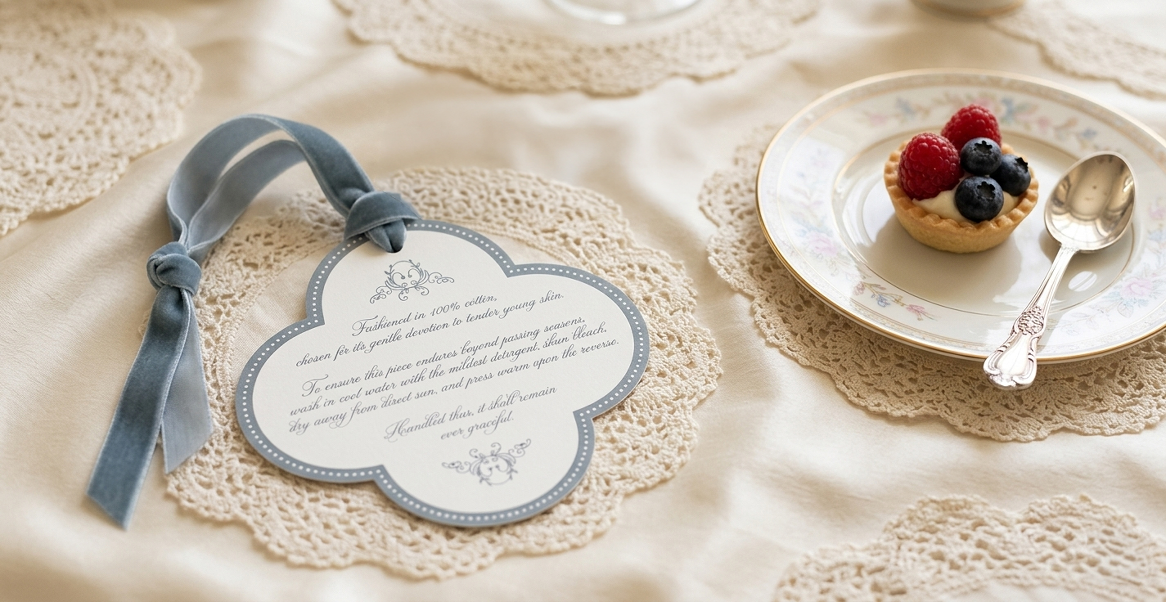
Lord & Lilies is built on a quiet, unfashionable belief: that a child's early years deserve clothing made with the same care and intention as anything meant to last a lifetime. The identity was designed to hold that belief — without over-explaining it.