BRANDING + PACKAGING + WEBSITE DESIGN
The nutraceutical market has a clarity problem. Too many products, too many claims, too little honest information about what any of it actually does once it's inside your body. Most supplements on shelves today can't be efficiently metabolised — which means the dose on the label and the dose you actually absorb are two different numbers. The industry had made peace with that gap. Easterly hadn't.
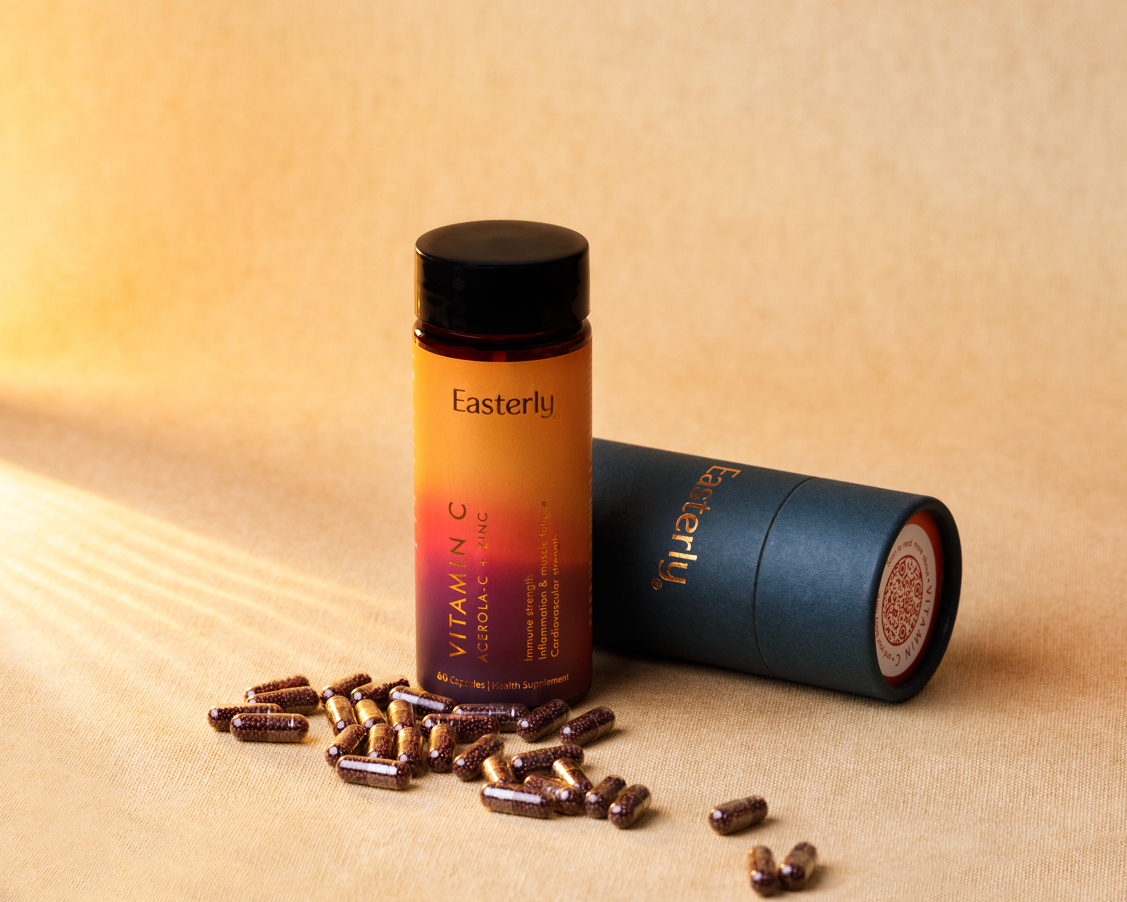
Their answer was to go back to basics with precision: isolate the ingredients that work, strip out every additive that doesn't earn its place, and redesign the delivery system from the ground up. Pellets in a pill. Nothing standing between the ingredient and the body that receives it. They came to us to build a brand worthy of that conviction.
The brief was to make something that looked as precise as it was. A supplement brand with nothing to hide — and no reason to shout.
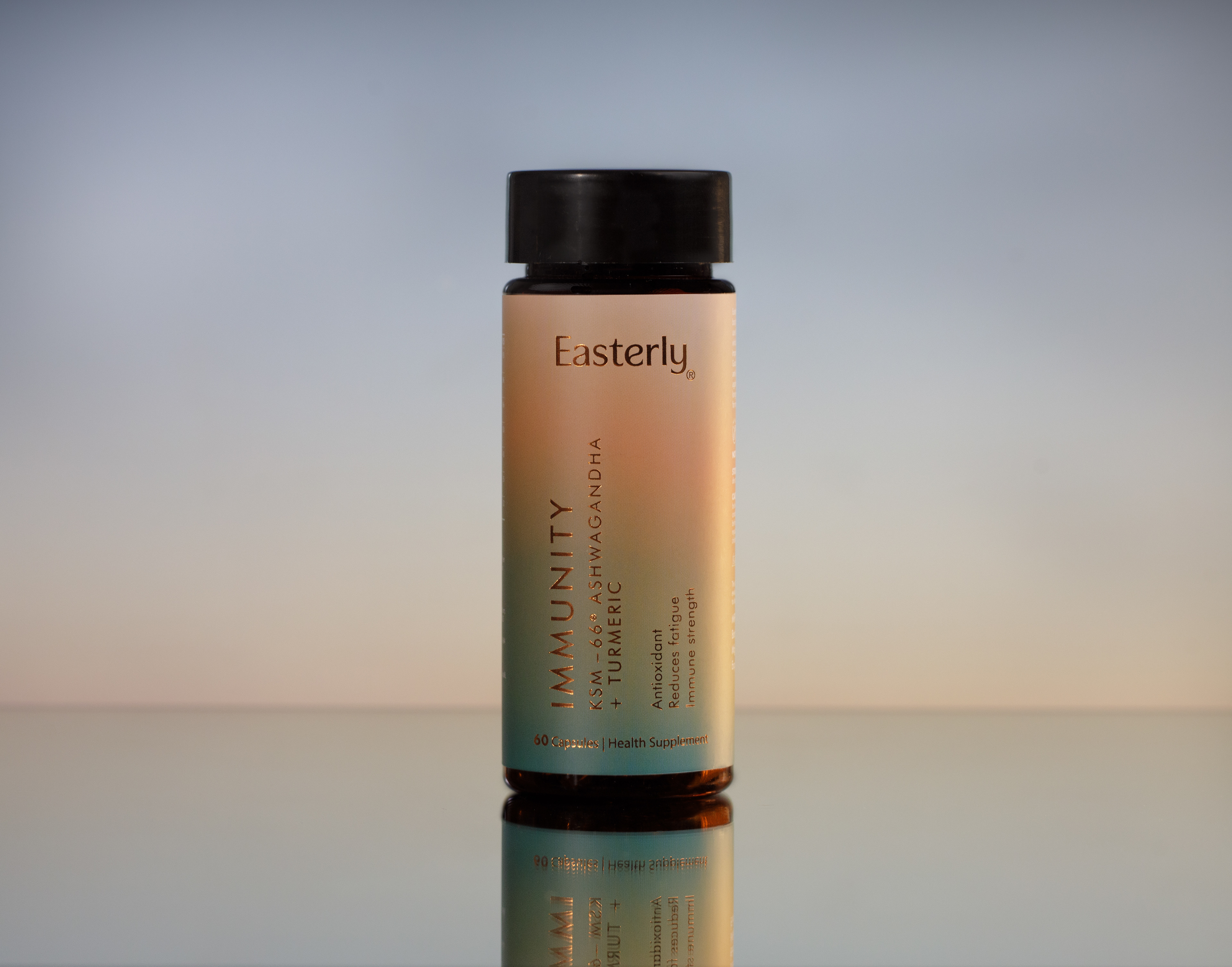
The brand world we built for Easterly lives at a particular hour of the day. Early morning, before demands are made. The quality of light when things feel still possible — warm but not loud, optimistic without effort. It's the hour the brand is designed for: the quiet ritual of something that works, taken consistently, without ceremony.
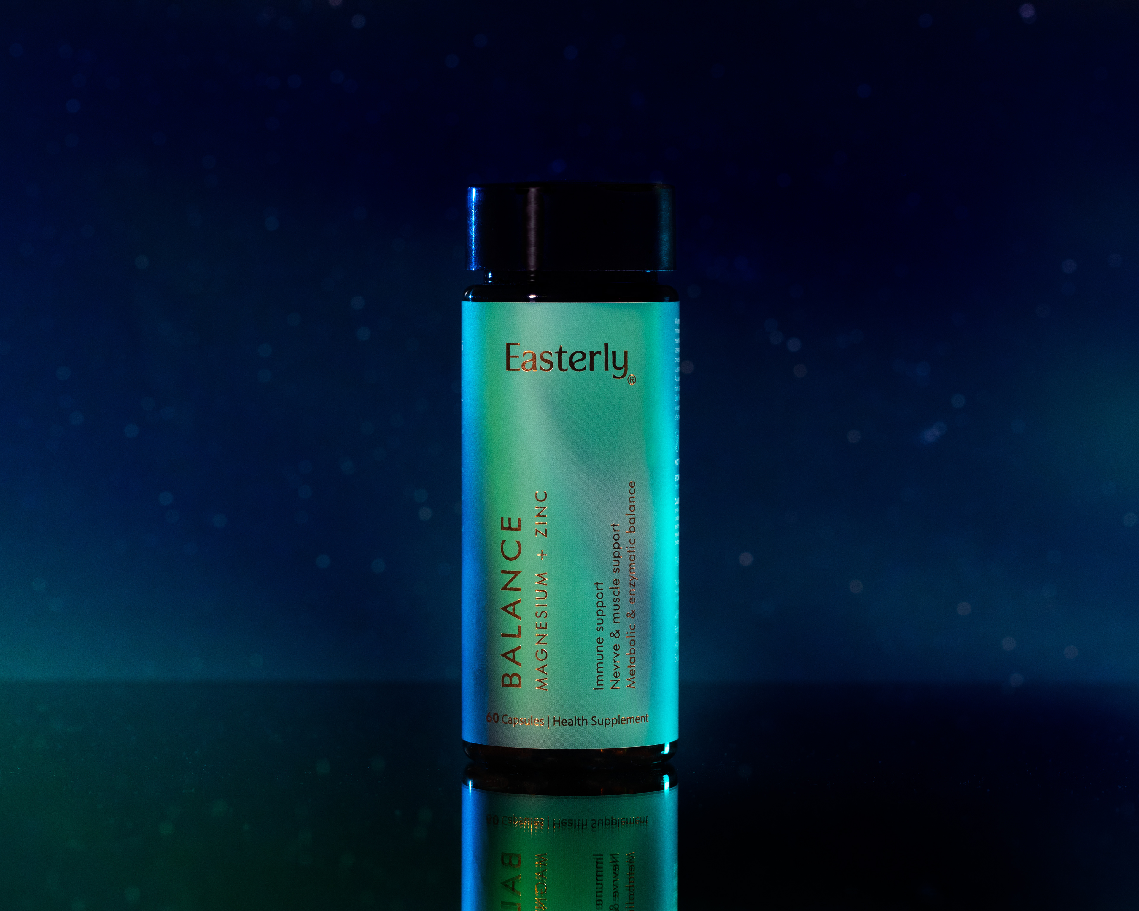
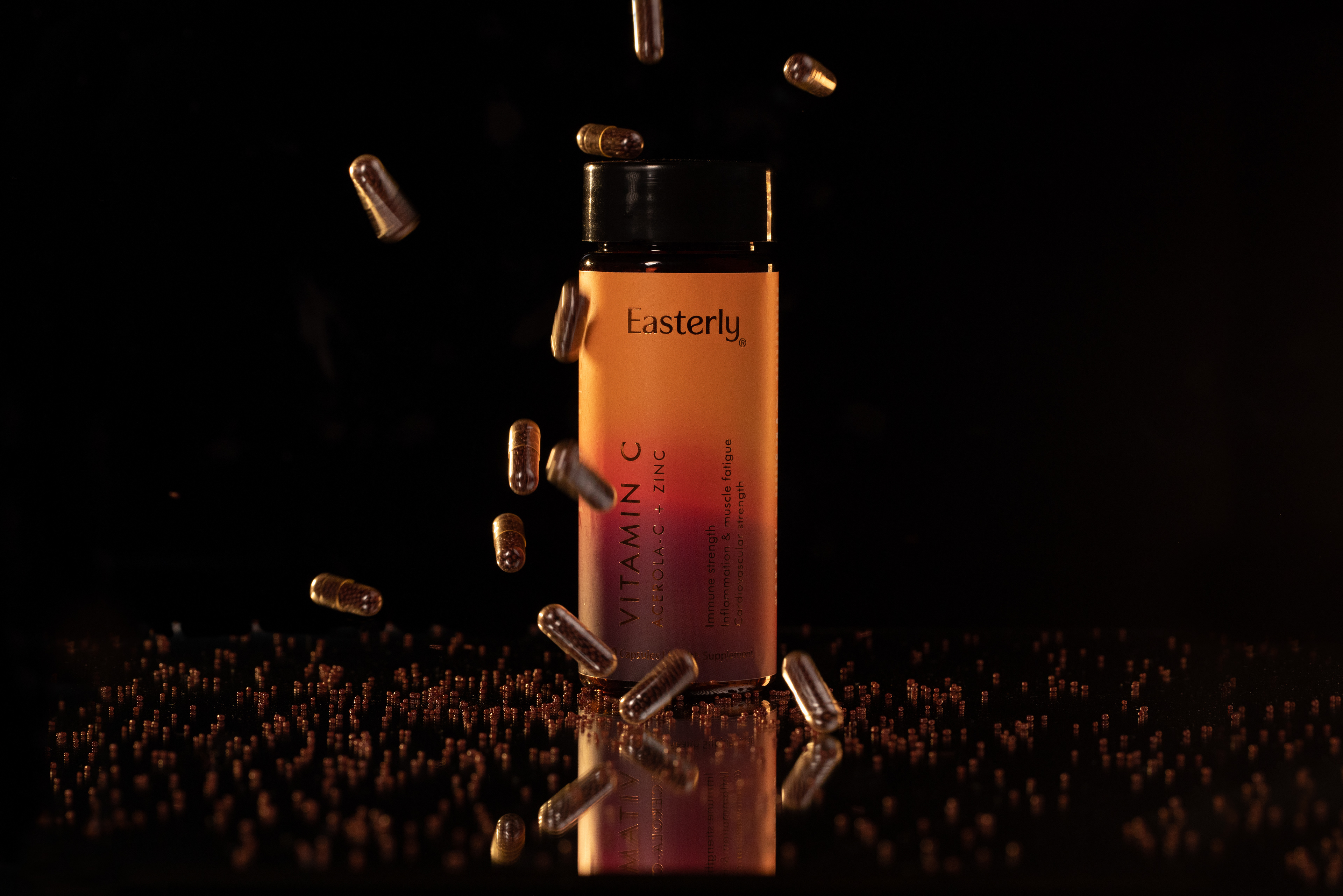
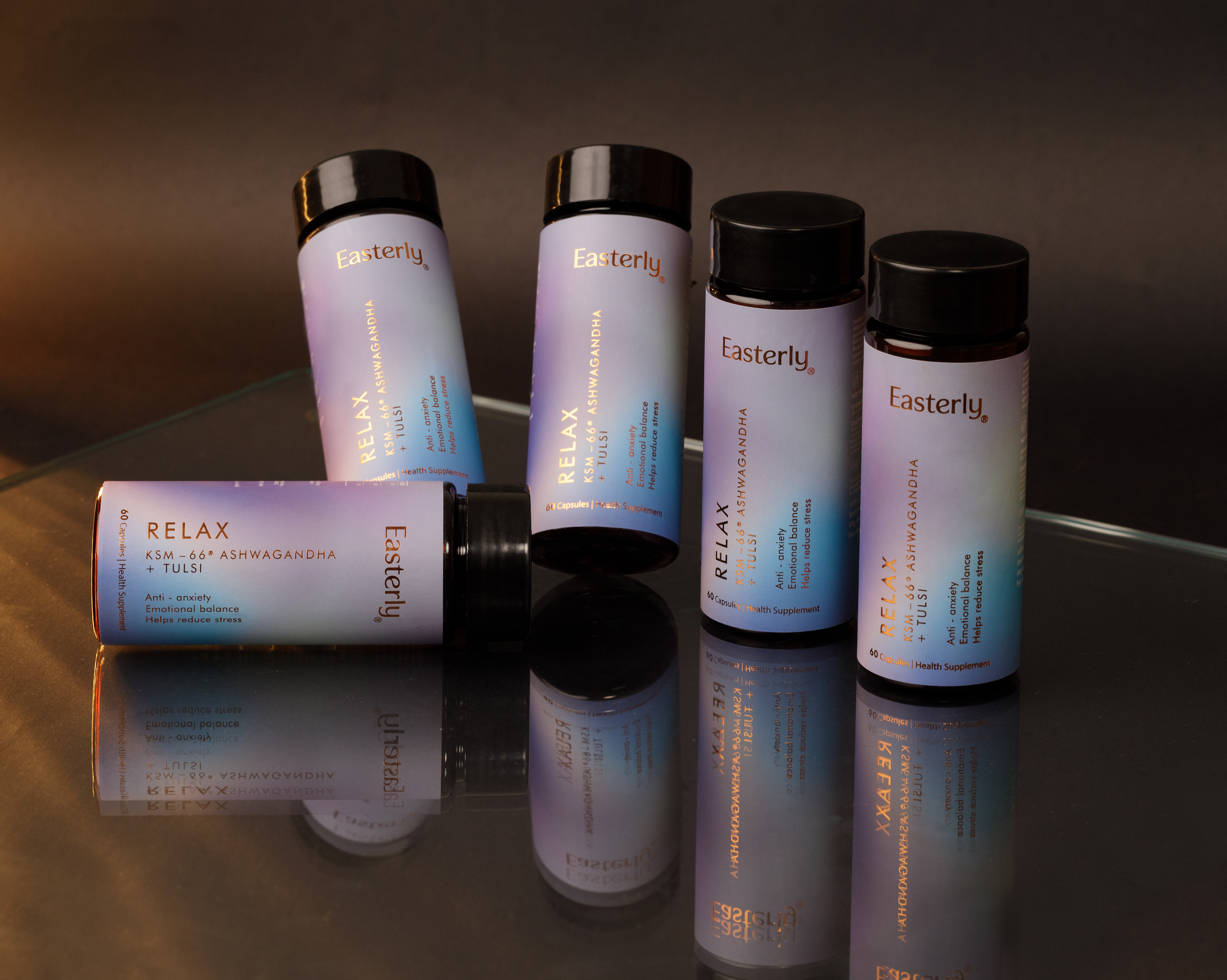
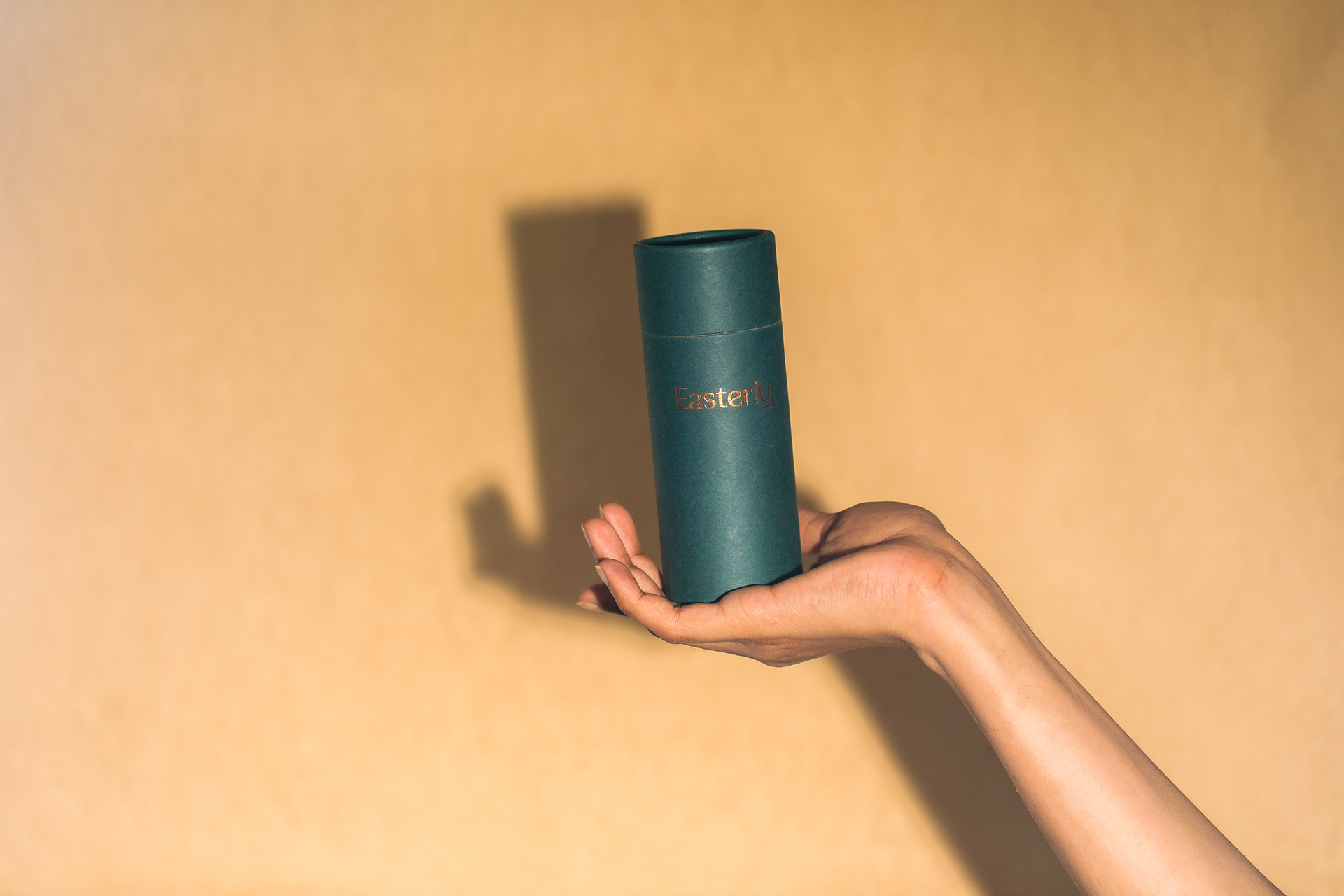
The aesthetic territory was deliberately not clinical. The wellness category defaults to cold white and pharmaceutical blue when it wants to signal purity, and to oversaturated green when it wants to signal nature. Easterly needed neither. What it needed was the visual equivalent of its own product: refined, considered, and stripped of everything unnecessary.

The palette was drawn from light, not from nature directly — a distinction that matters. Sun at different temperatures: the pale gold of early morning, the warm neutrals of midday, the soft amber of late afternoon. Colours that age well and sit quietly on a shelf. Nothing that competes with the ingredient list. Everything that earns the word clean.
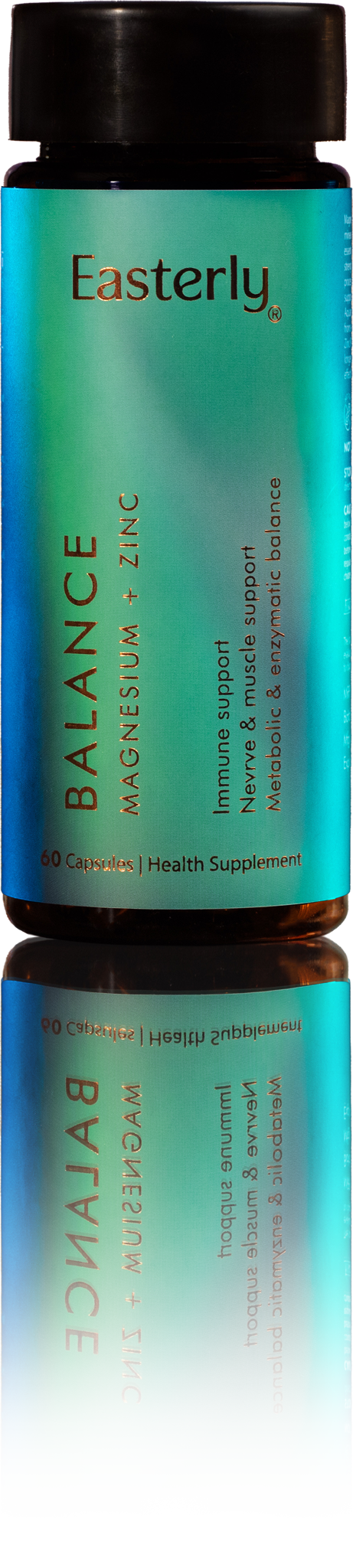
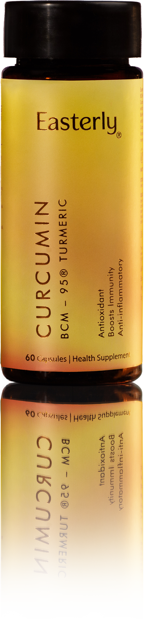
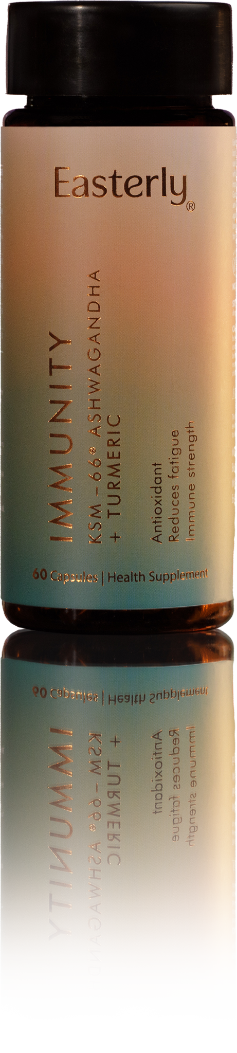
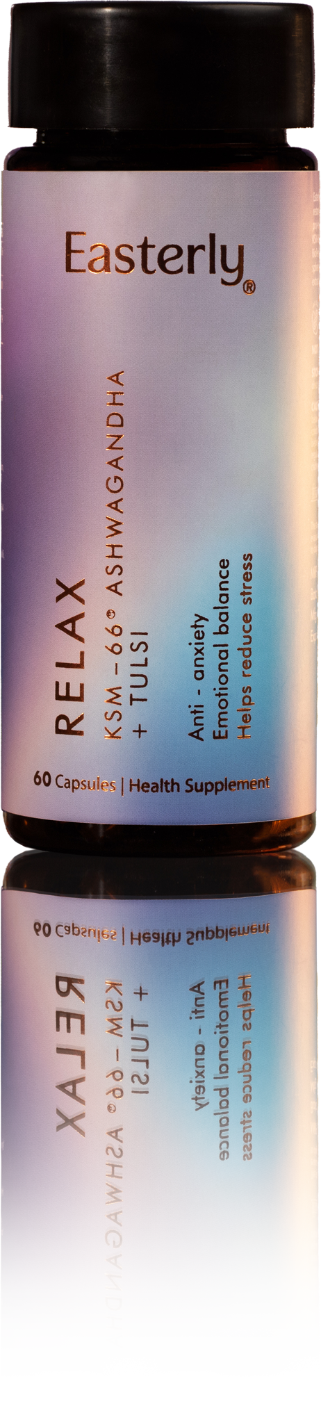
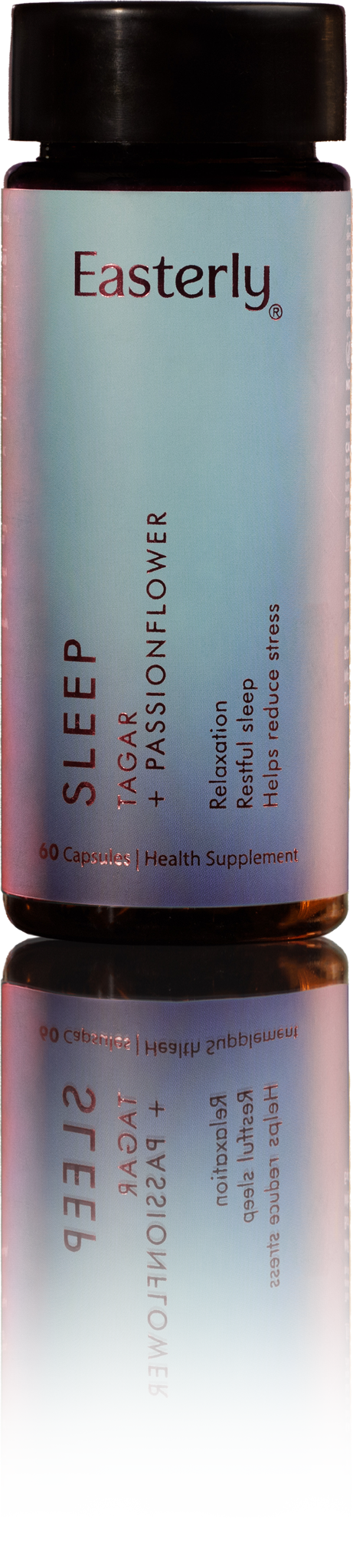
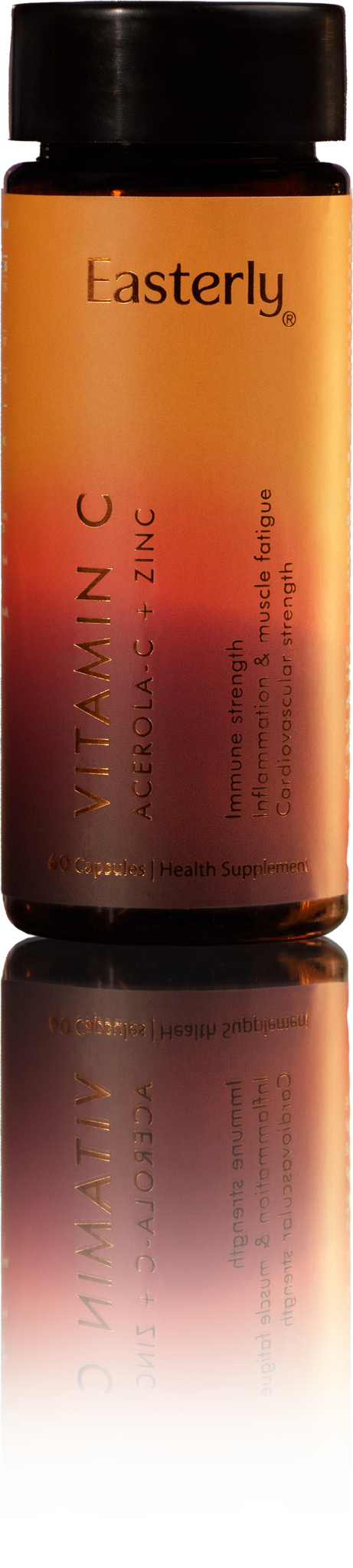
Easterly was built on an unglamorous belief: that a supplement should do what it says, absorbed fully, without fanfare. The brand was designed to hold that belief visibly — on the bottle, on the box, and on every page of the website. Precision as an aesthetic. Clarity as a value. Nothing added that doesn't belong.
Project: Easterly · Studio: Studio Apara · Scope: Brand Identity, Packaging Design, Website Design
Clean, by design.