Brand Identity • Logo Design • Colour System • Packaging Design • Illustration • Print Production
Redesign the complete brand identity and packaging for a family-run health food business of nearly two decades — one that needed to look as honest and considered as it actually was, without losing the warmth that had kept its customers loyal.
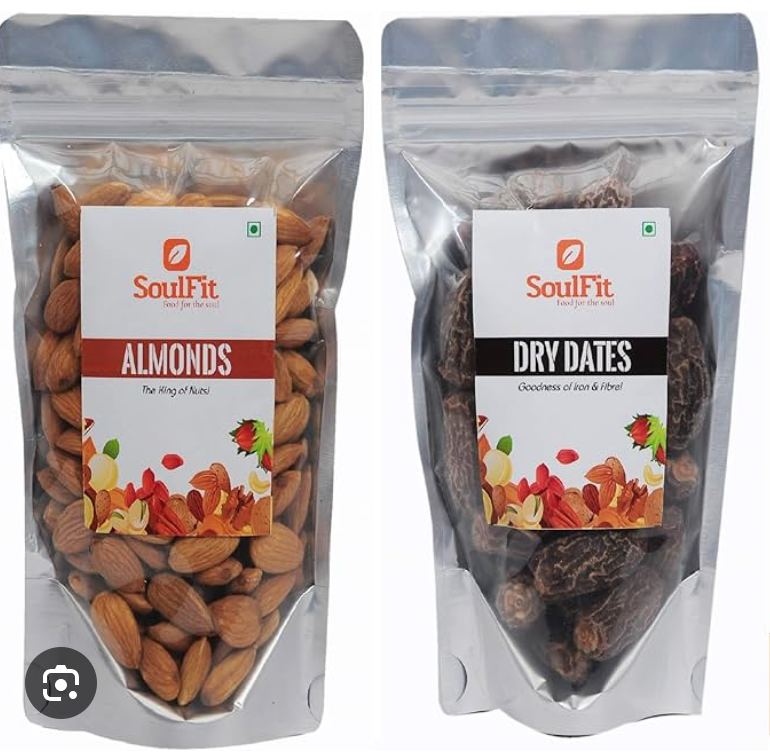
before
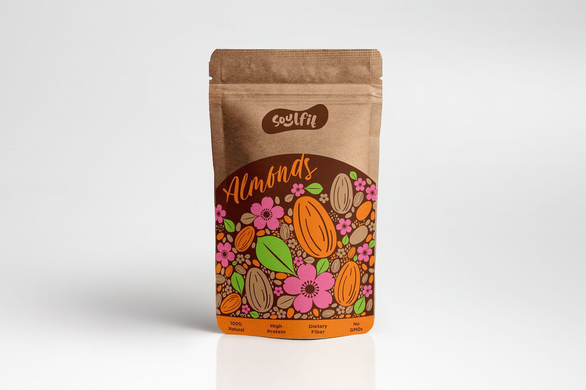
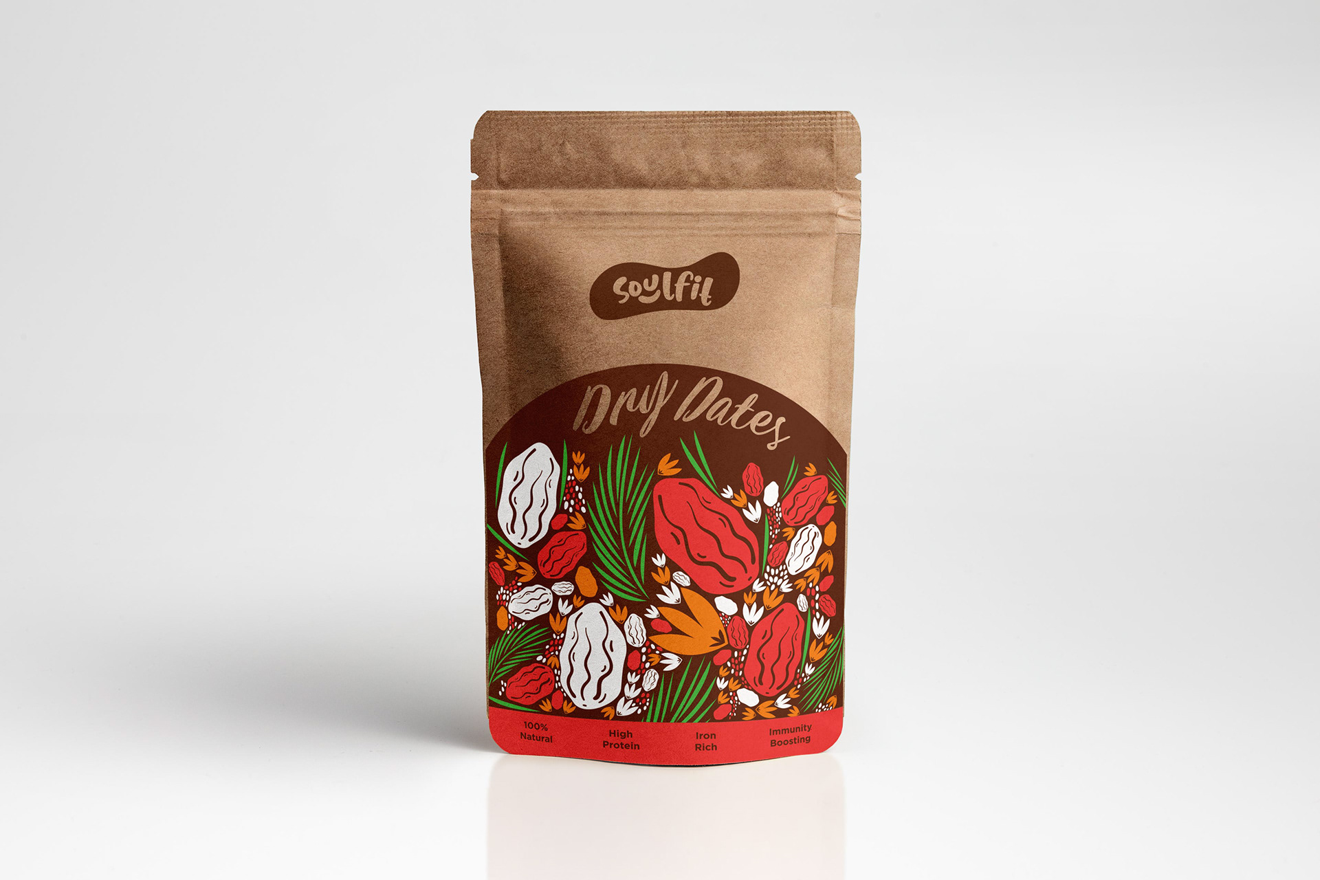
AFTER
Soulfit Foods has been quietly doing the right thing since 2006. A family business built on a genuine philosophy — wholesome ingredients, sustainable sourcing, nothing hidden — it had the kind of integrity that most food brands manufacture and most customers can sense is missing. What it didn't have was a visual identity that matched.
The brief was a complete rebrand: new logo, new colour system, new packaging. The ask underneath the brief was simpler —
make it look like what it is.
The brief was a complete rebrand: new logo, new colour system, new packaging. The ask underneath the brief was simpler —
make it look like what it is.
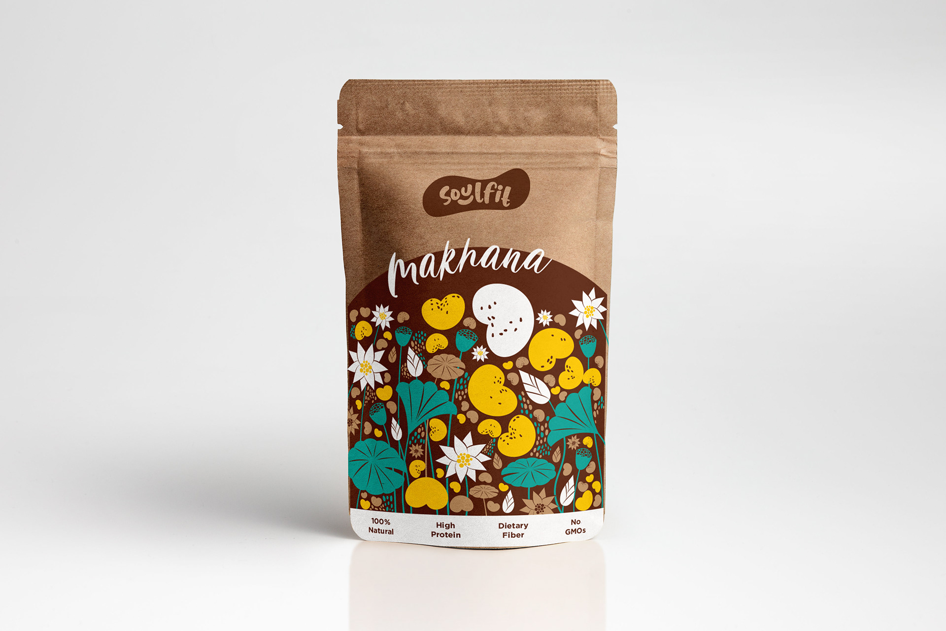
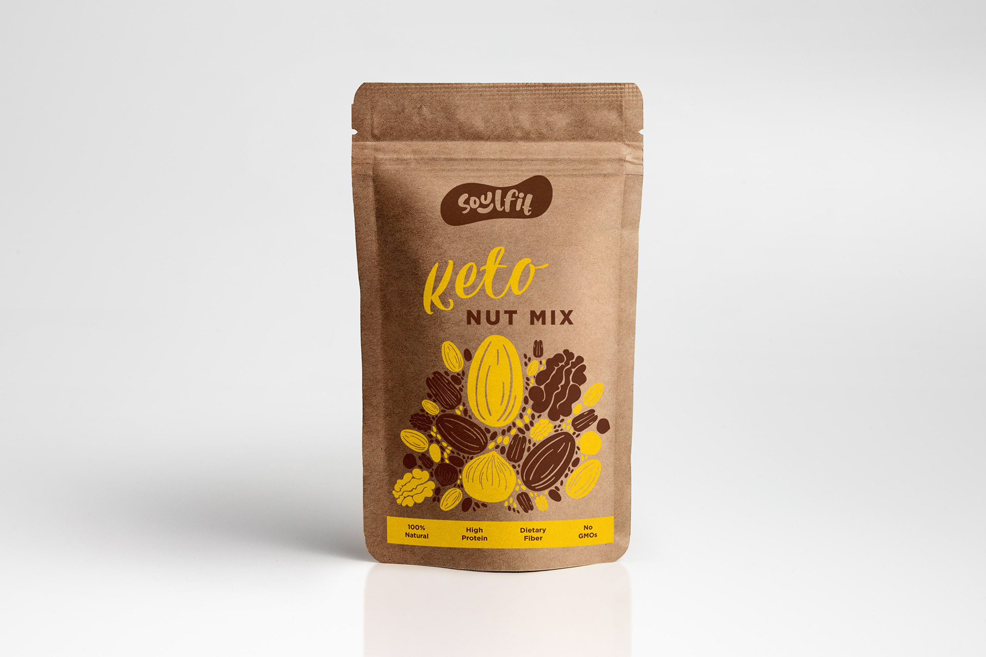
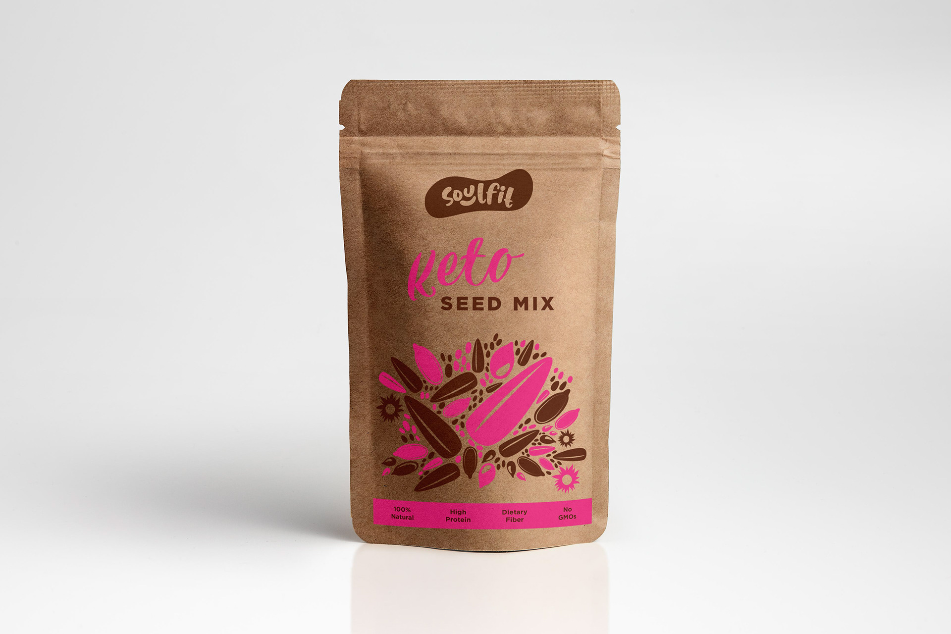
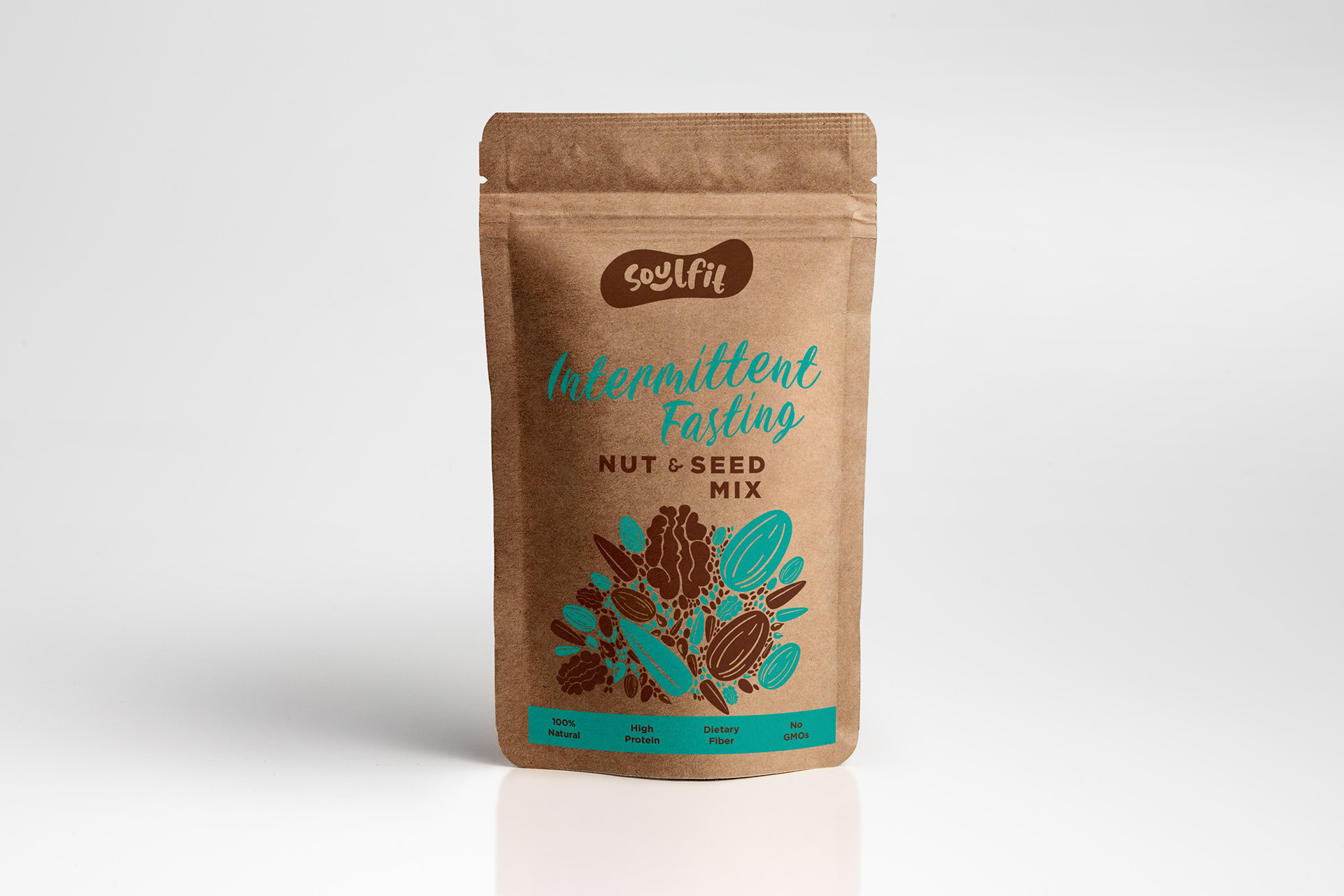
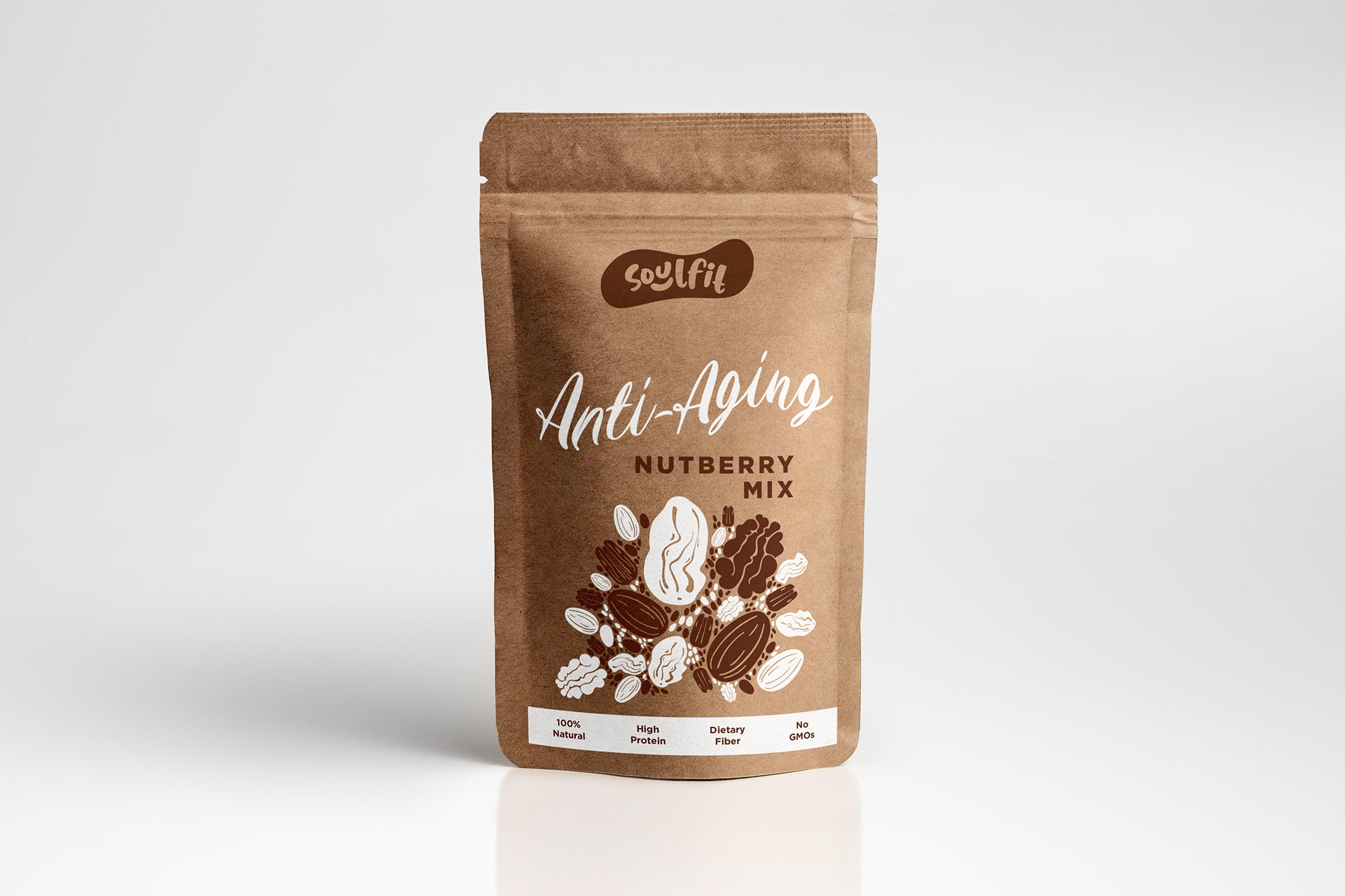
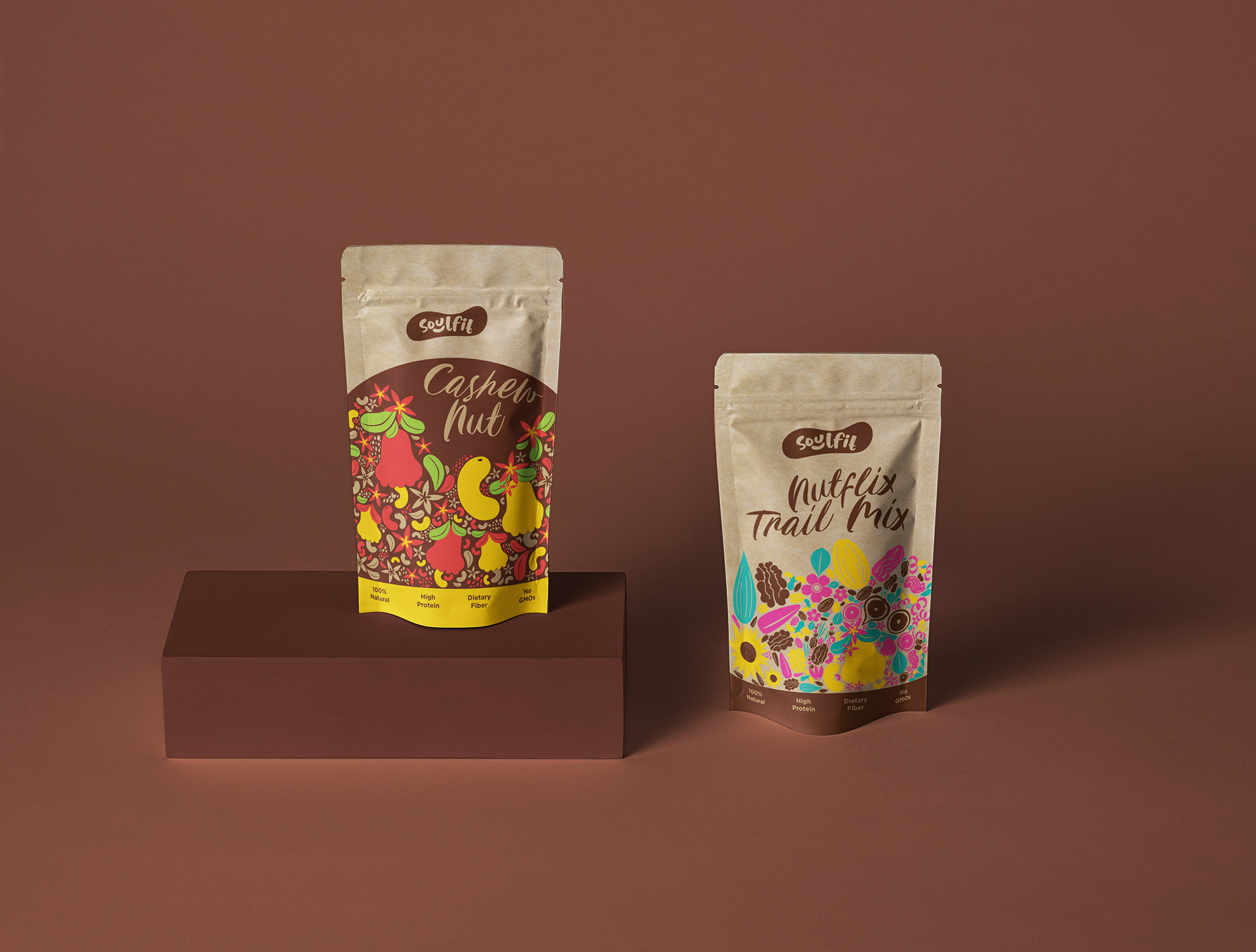
The logo begins with a cashew. Not arbitrarily — the cashew's form is one of the most distinctive in the natural world, immediately legible at any size, and it has a quality that no other nut quite has: it looks like a smile. That double reading is the foundation of the mark. The cashew-smile is rendered in warm orange — a colour that is simultaneously nutty, friendly, energetic, and alive. Healthy food, the identity insists, should not look like medicine.
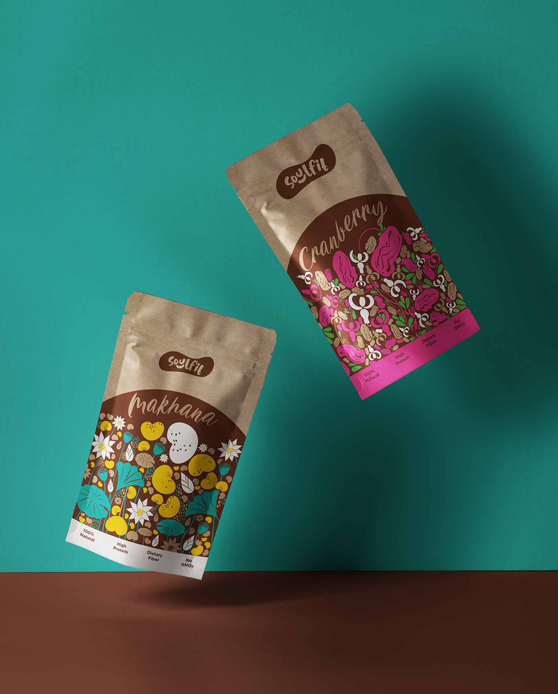
The colour system holds a deliberate tension. Pink and teal arrive as accent colours — vivid, eye-catching, unapologetically contemporary — while the primary brand colour is a muted, earthy brown that pulls the whole system back toward the ground. Back toward soil, toward origin, toward the thing that health food is actually about: that it came from somewhere real.
The packaging was the project's most demanding and most rewarding problem. The draw of natural food is that it is chemical-free and of the earth — and the packaging needed to say that before anyone read a word. The solution was eco-friendly kraft paper as the substrate, carrying a set of custom illustrations developed specifically for each product: each one depicting the ingredients inside, and something of the landscape they came from.
The brief underneath the brief was simple: make it look like what it is.
A family business that has been doing the right thing since 2006.
A family business that has been doing the right thing since 2006.
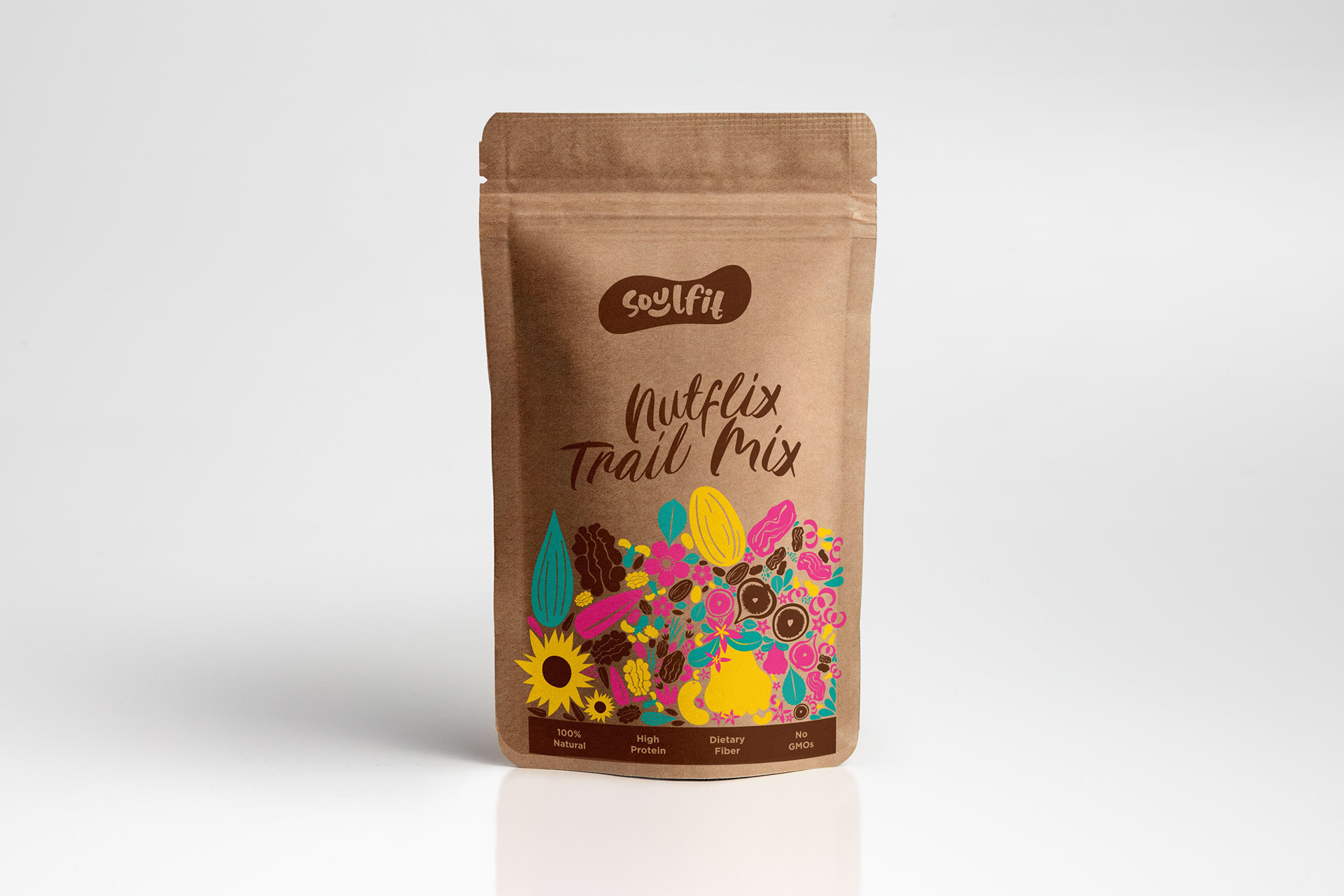
The illustrations were screen printed — a process chosen deliberately. Screen printing reads, physically and visually, as handmade. It evokes the hand-picked, the careful, the considered. On kraft paper, in these colours, it produces exactly the quality that Soulfit Foods had always had and never quite been able to show: that someone made this, and meant it.