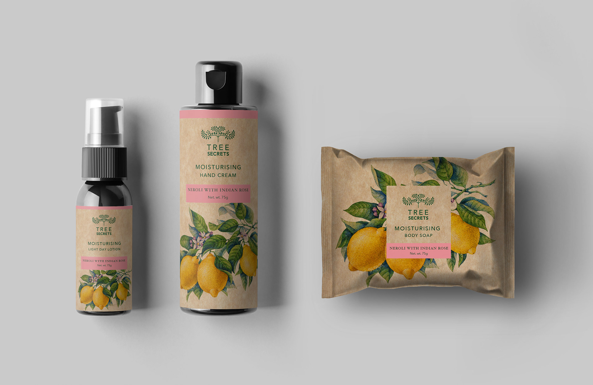
Tree Secrets is a botanical personal care brand built around ingredient purity.
The objective was to create a brand that felt grounded and credible without leaning on the usual “natural” clichés.
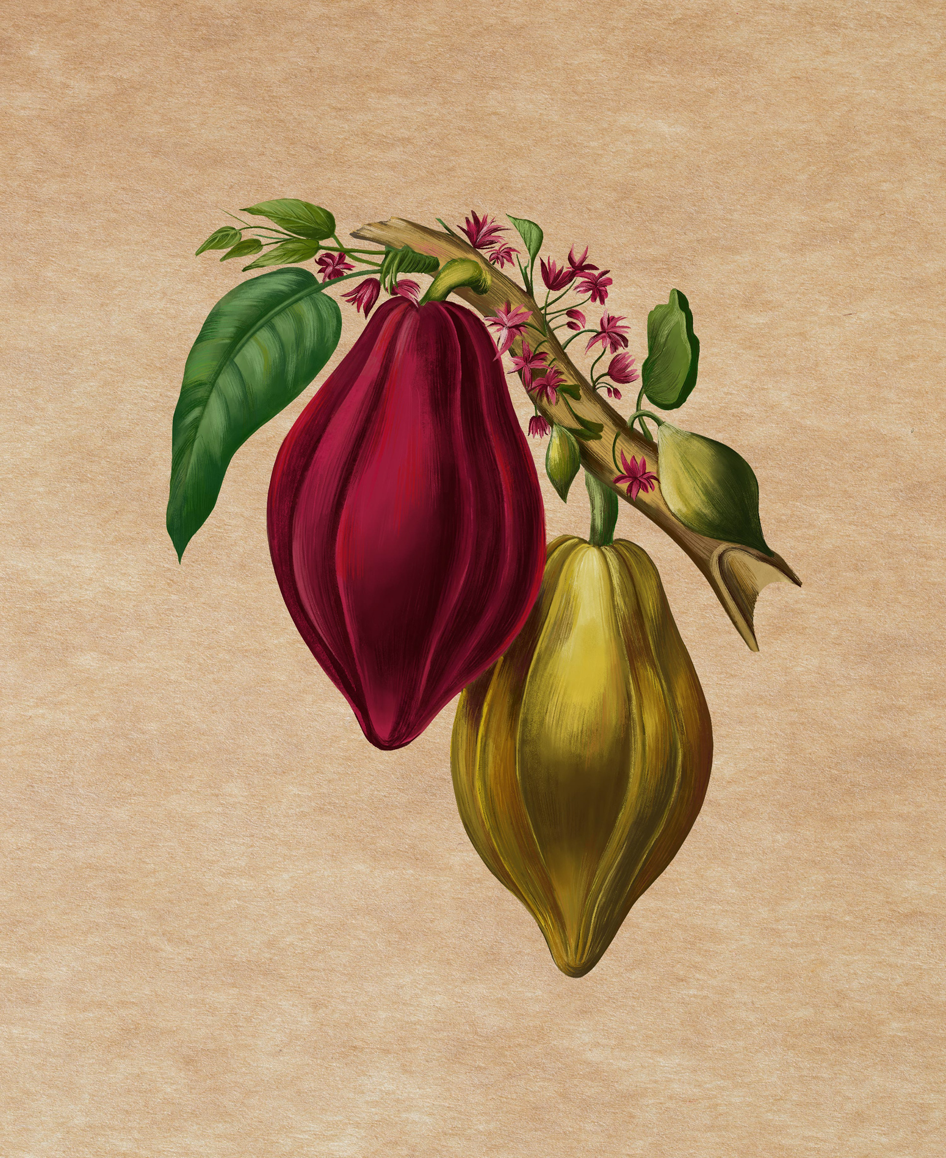
Make the ingredient the hero.
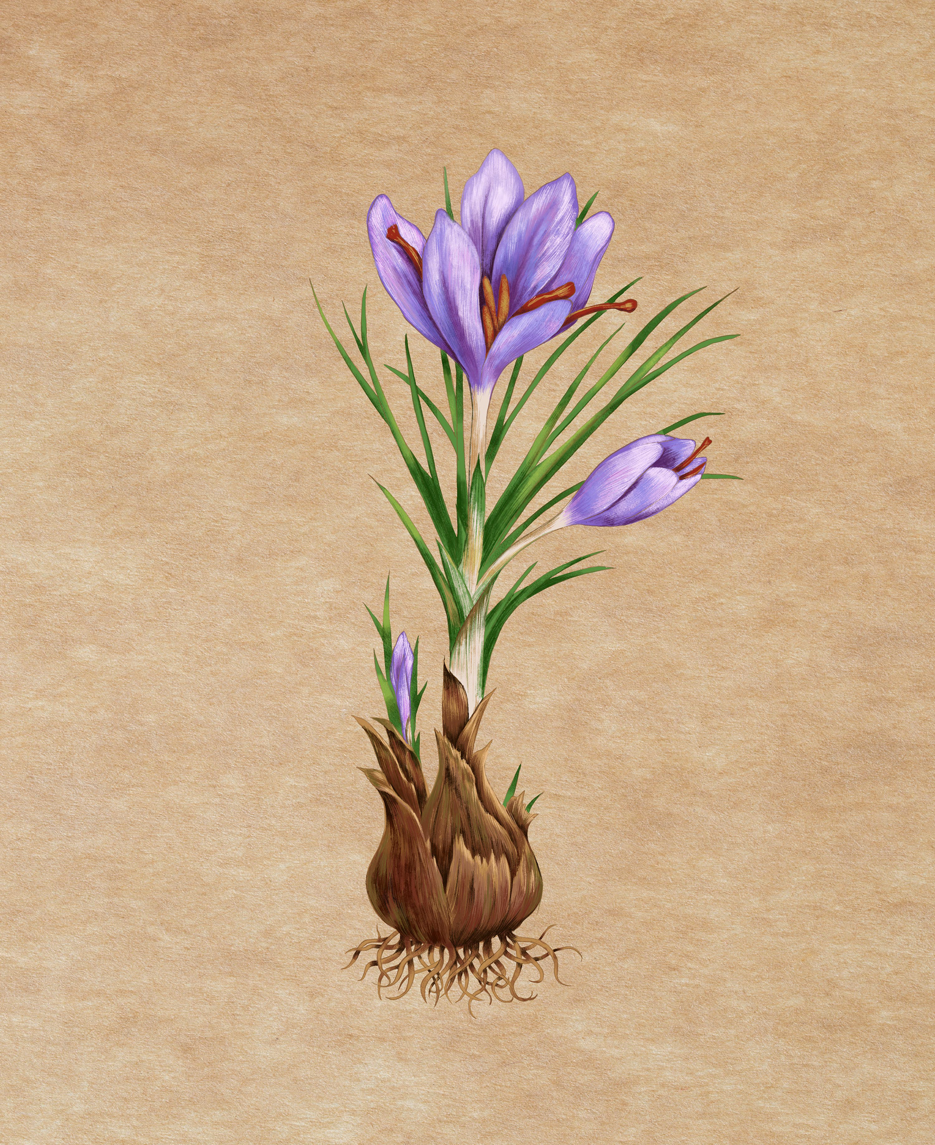
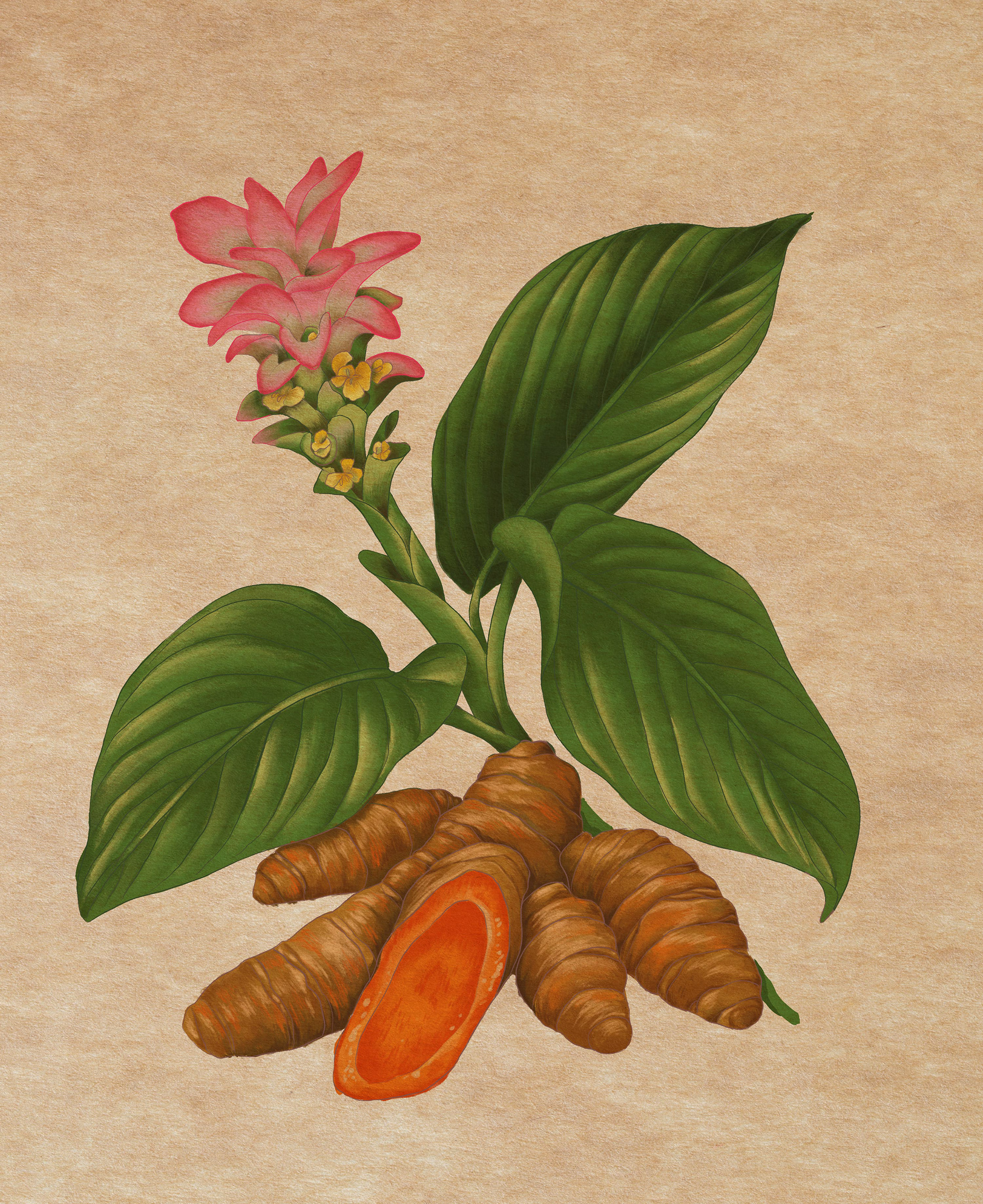
Each product is anchored by a botanical study, illustrated in mixed media. Not decorative.
Informational. Intentional.
The illustrations function as both storytelling device and system.
The visual language balances:
• Archival botanical reference
• Contemporary typographic restraint
• Warm, tactile material cues
A neutral kraft-inspired base creates consistency across SKUs. Controlled colour bands differentiate variants without fragmenting the range. Typography remains structured and quiet. The layout prioritises clarity and hierarchy.
A modular grid allows the brand to scale across formats, from pump bottles to wrapped soaps.
Illustration scale adjusts by format, maintaining recognition at shelf while avoiding visual noise.
Every element is reduced to what is necessary.
A botanical brand that feels composed, not styled. Ingredient-led. System-driven. Built for longevity.