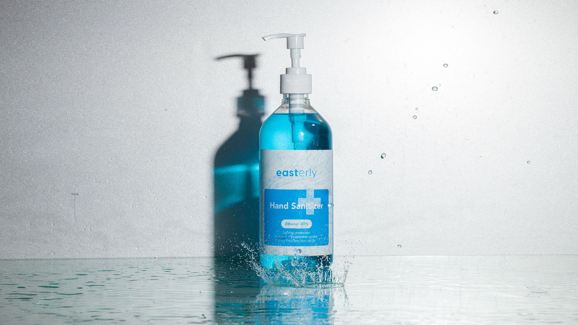
Easterly responded to the COVID-19 pandemic with a new product – a hand sanitiser. Clinically developed with the primary purpose of fighting off harmful germs and keeping people safe, their product is created strictly in accordance with WHO standards. They asked us to develop branding and packaging that would reflect this mission.
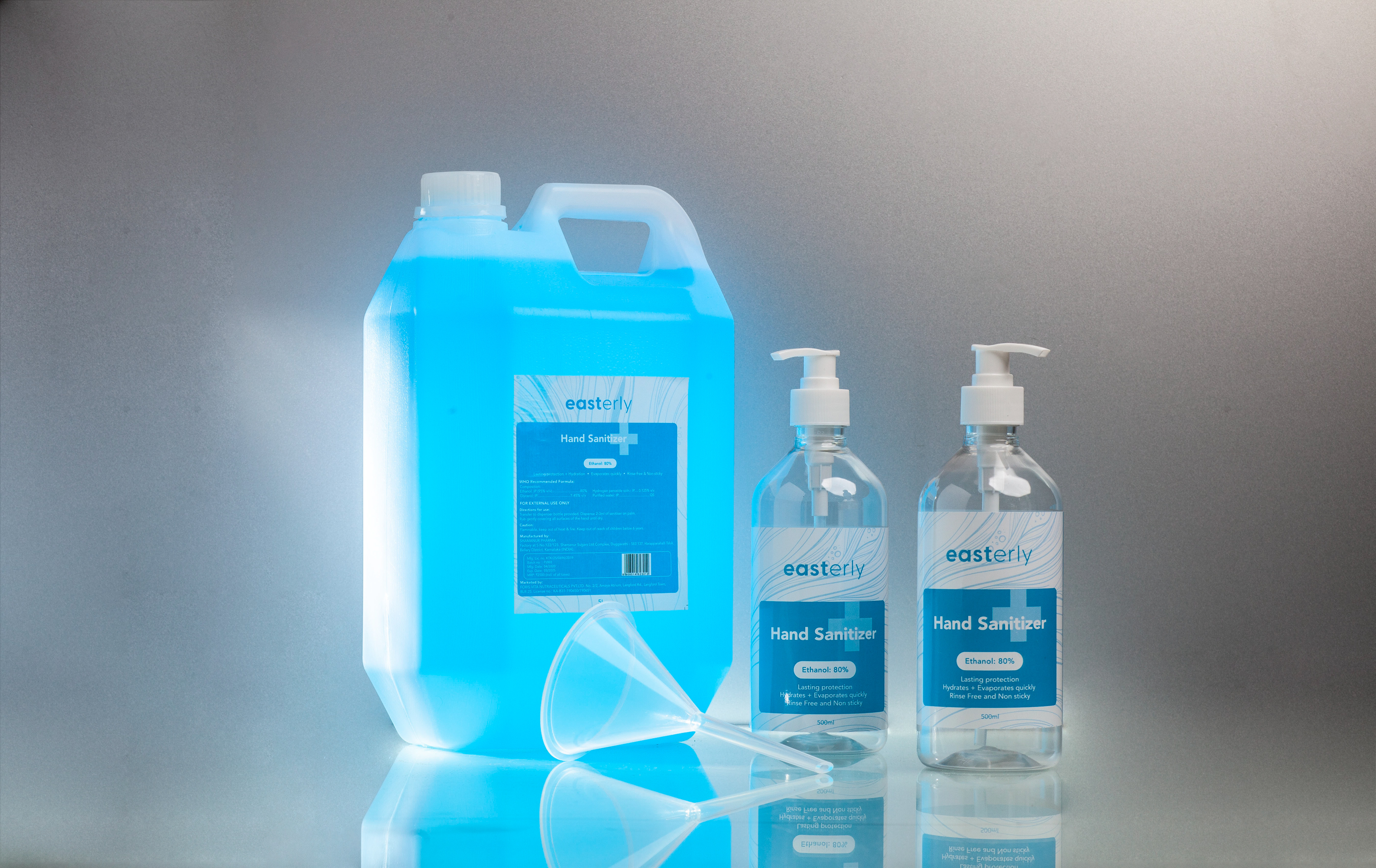
Being a new brand in a vast market, the brand logo,
label design and website had to be distinctly different
and also capable of engendering trust in those strange times.
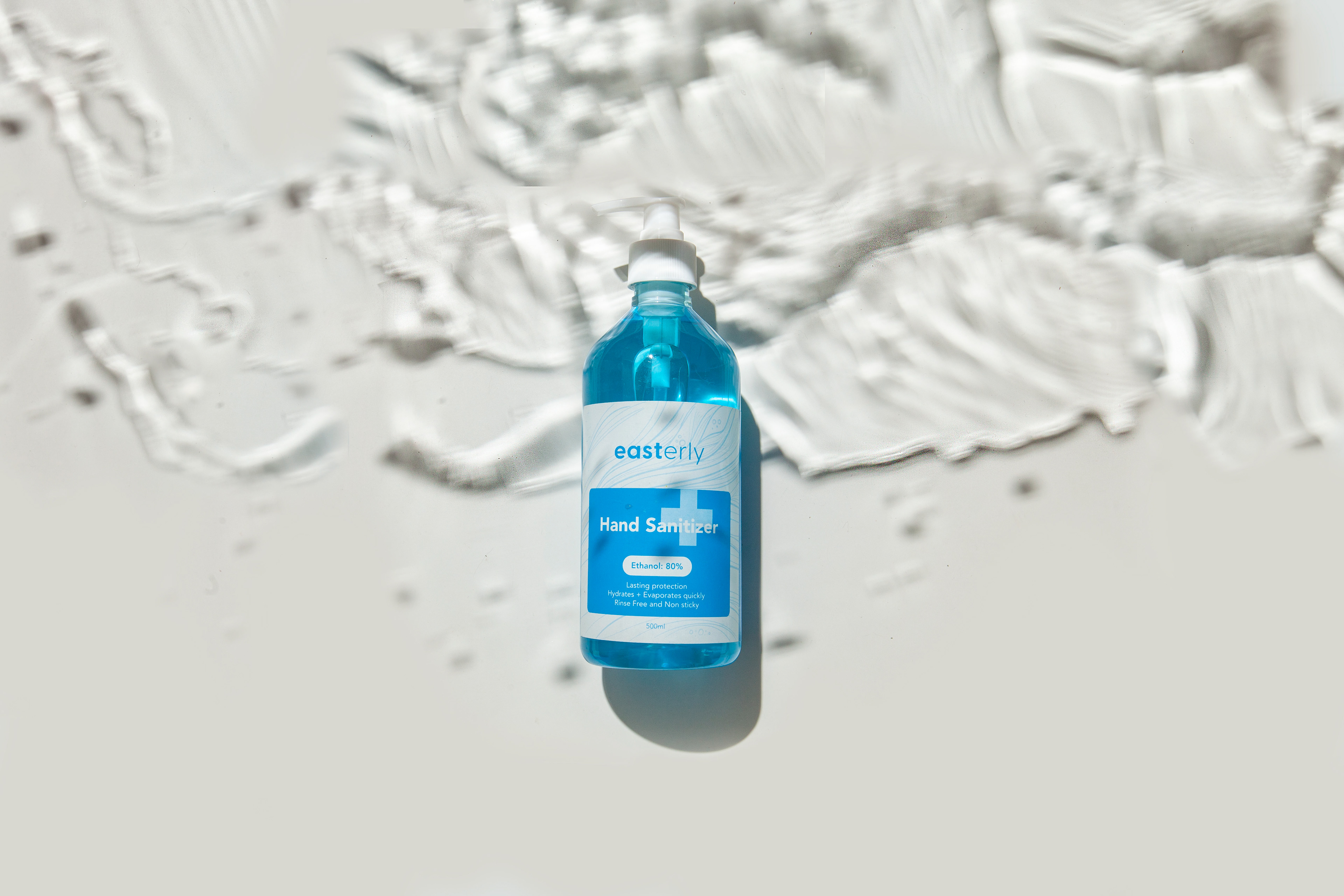
The branding had to inspire calm, soothe and uplift.
label design and website had to be distinctly different
and also capable of engendering trust in those strange times.
The branding had to inspire calm, soothe and uplift.
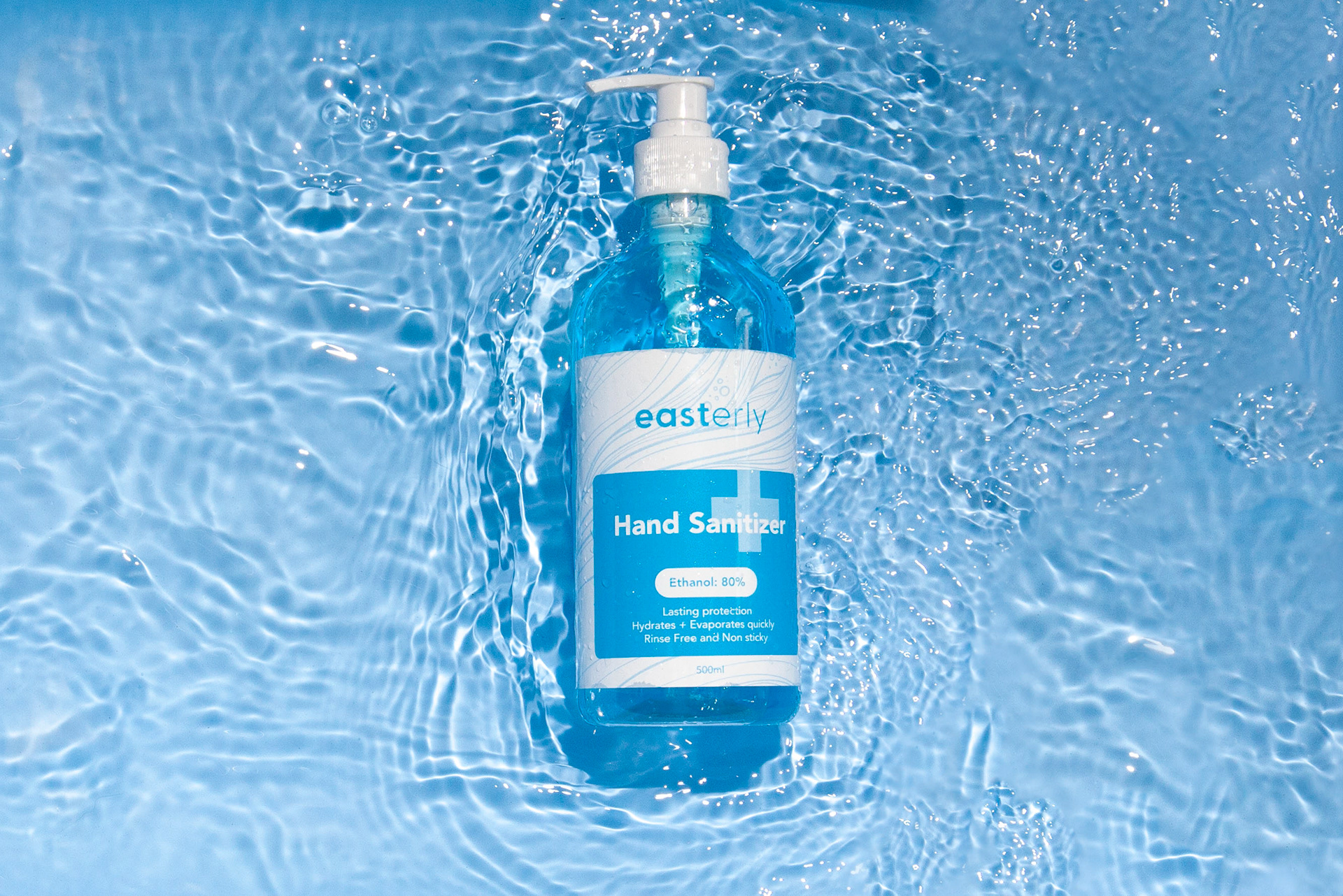
Here’s how: We chose to go forward with a minimal look
for the brand with blue as the primary brand colour
so it would speak to the brand values of cleanliness and freshness.
for the brand with blue as the primary brand colour
so it would speak to the brand values of cleanliness and freshness.
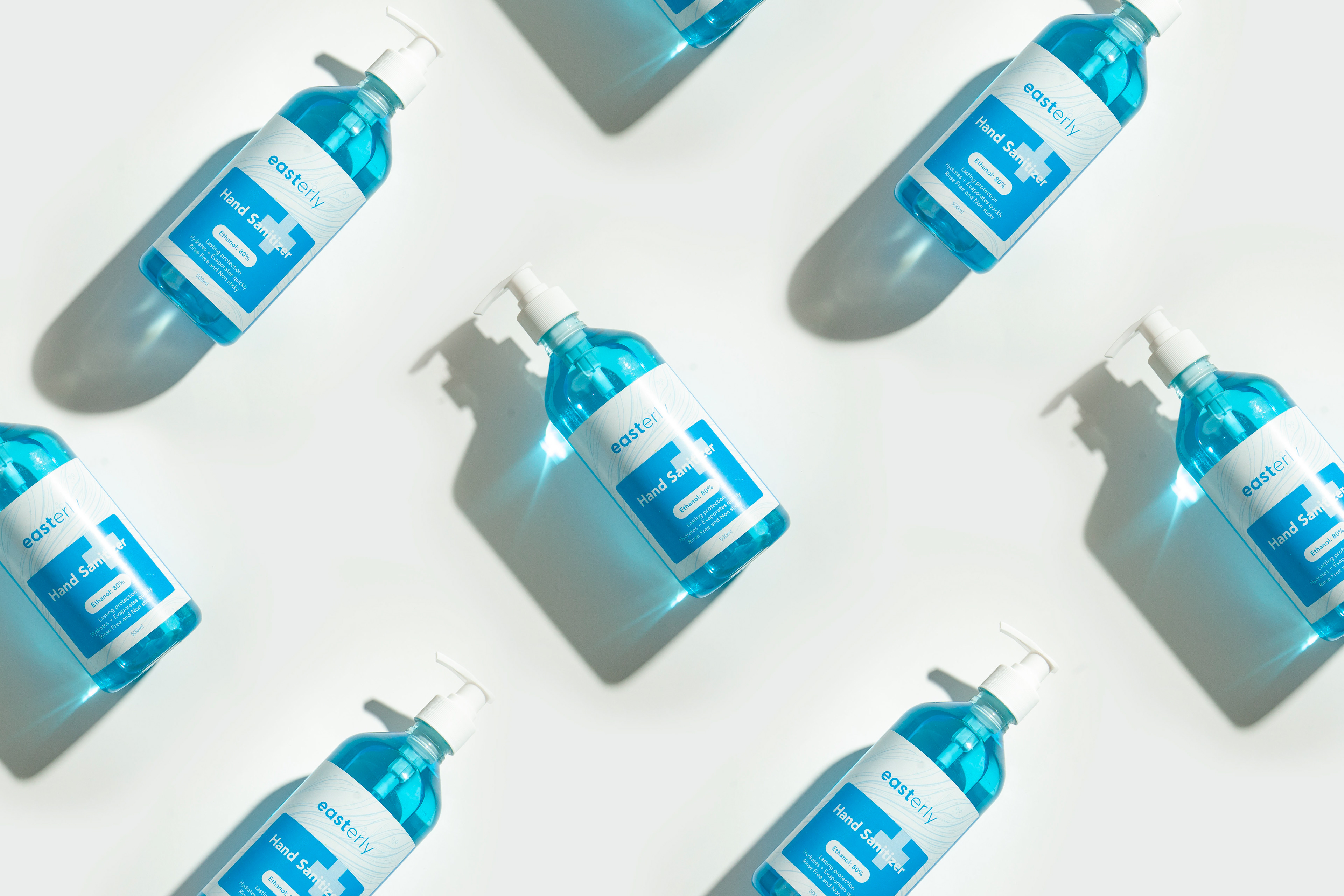
We also created iconography and imagery
that would complement these qualities.
that would complement these qualities.